A series of wet gray days have kept me from painting outside, so I've spent some time putting my studio (and myself!) back together in the aftermath of the workshop. For me, "spring cleaning" always seems to make things look worse before they get better.
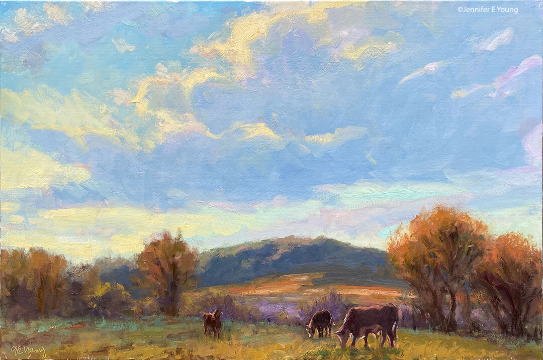
I have little piles around me...piles of books, of paperwork, and also a small pile of unfinished paintings. Among the latter is this demo painting that I started in the workshop, which I may noodle around with and bring to a more finished state. It's small, just 12x9", so we're talking maybe just orzo or macaroni-sized noodling.

I started this workshop demo talking about composition and values and how they related to each other. Since we were working with the limitations of photographs, I wanted to try to get folks to think about the possibility of composition beyond just what they saw in front of them in the picture. When I'm painting en plein air, I will often do a series of small value sketches before I jump right into painting. I will use this same approach too in the studio, to develop my design.
Along with a contour sketch, it is extremely helpful to do this in a very abbreviated quick grayscale, so that I can get a general idea of my value relationships and the overall design that is created not only by the placement of line but also by the pattern of dark and light:
 Â
 

This is not a new concept, of course. Artists have forever been studying and writing about the arrangement of values (lights and darks) to compose a strong design. The artsy fartsy term for this is "Notan". Okay, it's actually Japanese. Notan sketches can be fleshed out in recongnizable contours (like mine above) or they can be very quick and gestural thumbnail abstractions created for the purpose of identifying the underlying design.
The values are generally limited to four or less. I used 2 markers; black and light gray, deriving my middle gray from a blending of the two, and letting the white of the paper stand as my lightest value.Â
Of course, in life we see a much wider range of values, but in designing and executing a painting, I'm learning that simpler is often better. If you look at many of Monet's paintings, you might notice that many of them have a very small range of values indeed, and he used color temperature and very soft edges to add a wonderful sense of atmospheric depth to his work.
A quick Google search for "Notan" yielded some good results for further exploration:
How about you?
 "Springtime at the Chateau de Lourmarin"
Oil on panel, 6x6"


 "Color Surprise"
Oil on Canvas, 6x8"


 Â


 "Reverie des Roses" (Provence, France)
Oil on Canvas, 24x30"


 "Sentier aux Coquelicots" (Trail of Poppies)
Oil on canvas, 24x30"


 "Wash Day"
Oil on Canvas, 7"x5"


 Â
  Â
 
 Â


