Time and process

Well, for the most part, my resolve last week to get "back to painting" crumbled, as I found myself distracted by a number of other issues. I haven't been in the best command of the schedule I'd set up for myself, setting aside my painting time to do a million different errands and tend to personal issues as well. The tendinitis continues to bother me, too, which isn't helping my stick-to-itiveness.  In hindsight, in spite of my injuries, I  probably should have made myself stick as much as possible to the same schedule regardless of whether I'm actually "painting"-- filling the gaps with new art-related activities (like reading one of my gazillion art books!) In any event, I am starting again--finally-- with a color block-in which I'm including below:

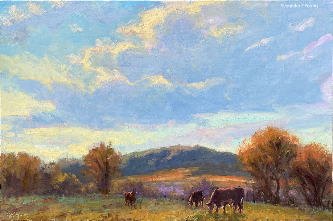
tuscany painting in progress by Jennifer Young

Because of the shoulder/arm thing, I've had to make a few changes to the way I work so that I'm not in a huge amount of pain by the end of the day.  I've lowered my entire painting setup, paint for shorter intervals, and also set a timer when I am painting to go off every 30 minutes. It reminds me to stop and stretch and give my muscles a chance to release the locked position I tend to take when I'm hyper-focusing during painting.

Coincidentally, artist Robert Genn wrote an interesting little article last week in his twice-weekly newsletter about the timed exercises he uses for  attention and focus, (which naturally caught my attention!)  In the article, Genn suggests that by imposing shorter time limits on a work session (in his example 37 minutes), one is required to come into sharp focus, thereby energizing mind and spirit (and often one's painting as well.) I don't think Genn is suggesting that one should always commit only 37 minutes to complete a painting! Rather, these are exercises to 'shake things up' and breathe new life and energy into old, comfy work habits.

It's a good idea. And it's one I've implemented myself (thoughI used a kitchen timer rather than an elusive 37-minute hourglass.) While Genn required his students to complete small paintings in his timed exercises, I've also found that the practice works great for plein air and larger studio paintings when you want to track how long you spend working on each stage of the process.

For instance, in plein air painting, where the shifting light already imposes a certain time limitation, the amount of time you spend establishing your composition is important not only to the painting as a whole, but also because it will dictate how much time you have left for the block-in and finishing. So for a smallish painting, I might wish to limit myself to 15-20 minutes to lay in my composition- DING! And 40 minutes for a block-in-DING! That leaves another 30 minutes to (possibly) an hour to make changes, refine shapes and edges and finish before the light changes too drastically (DING! Brushes down.)

You can play around with division of time if you wish, but the result, as Genn suggests, is often that you learn to hone your focus and think better on your feet, without giving yourself the chance to "noodle around" endlessly or jump into detail  too early in the game. It helps in more ways too, than just keeping you on track. For some reason, the timer helps to address all of the canvas during each of the timed stages, thereby avoiding the tendency toget lost in only working (or overworking) one section of the painting to the sacrifice of the others. I'm not sure why this is. Maybe it's just that using the timer stage-by-stage causes you to take a more deliberate, conscious approach at each stage, making the approach more methodical by breaking things down into digestible chunks.

While the timed-stages works particularly well for plein air painting (when time is truly of the essence,) I've found the same principal can also be worthwhile when applied in the studio, either by similarly timing myself at different stages in larger pieces, or, as Genn suggests, by (attempting to) finish an entire smaller piece in a short interval, as an exercise drill or a warm-up. So I thought I'd try it for the painting above, timing the initial compositional sketch and the color block-in at 15 and 40 minutes, respectively. I don't intend to finish this piece in just an additional hour. It's a 24x30" canvas and I certainly don't want it to look completely slapdash. On the other hand, I do hope to keep it as fresh as possible to re-energize myself now that I'm getting back to work.

Of course, anything can be annoying if taken to the extreme, but I can see how using the timer periodically can serve a useful purpose. It also provides good insight for me about my process, and just how much time I am spending therein.

Gold Rush

I mentioned the other day that I'd made a couple of sequential painting visits down at the James River near Belle Isle. This is the painting from the second visit. Just a view of nature this time, which shows the diversity that this one site allows:

"Gold Rush" Oil on Linen, 11x14" ©Jennifer Young

"Gold Rush" Oil on Linen, 11x14" ©Jennifer Young

I've painted this scene before, but I haven't gotten enough of it so I've experimented with a slightly different angle and format. I also pushed the color and handled the brushwork somewhat broader and more impressionistic; probably in part because I decided on a whim to return and once I set up and changed my mind, and set up again in a different spot (this happened a few times) I didn't have much time to capture the light that I wanted. I started right around rush hour, but the golden glow came closer to the end of my session, hence the title.

Ahh, oops, ah-ha, and ouch!

I have one more work to share today from the group I'll be taking to North Carolina for the "All Things French" show next week. This was done alla prima. More fun with light and shadow, and lots of paint! Ah, it's been such fun revisiting these lovely places through the act of painting them.

"Coleurs dus Sud" Oil on linen, 20x24" (SOLD) ©Jennifer Young

"Coleurs dus Sud" Oil on linen, 20x24" (SOLD) ©Jennifer Young

For this painting and the last one I posted, I experimented with an interesting double primary palette- Titanium white, Cad Yellow Pale, Golden Ochre (Rembrandt) , Organic Vermillion (Daniel Smith), Quinacridone Rose, Ultramarine Blue, and Manganese Blue (Old Holland).  I must say it was a lot of fun playing with these different colors. The gold ochre is dangerously lovely, and the organic vermillion was nice change up from cad. red light. In fact, it's similar, but the tinting strength isn't quite as strong so in some ways it was easier to use.

I went with this palette for a couple of reasons, but the key word is "economy". First it's an economy of time. The increasing pain in my arms was making it difficult to spend an inordinate amount of time mixing certain colors, even though I've learned enough about color mixing to know how to acheive most of what I need. I almost never use any color directly from the tube any way, but it helped to have a premixed earth, for the buildings for instance, and when such warmth in the scene predominates.

Second, it's an economy of money. I mentioned before that I have a lot of art supplies that kind of fell by the wayside once I discovered some preferred methods and materials, but now I'm starting to revisit those supplies to try and economize where I can. All of the paints and substrates are archival, quality materials, but I do have some far-out tubes of colors--some dating back to before I started painting landscapes!

The paint department at the Lowe's hardware store near our house has something they call the "oops bin". These are mixed paints of specialty colors that presumably didn't come out as expected. I guess you could say that I have my own "oops bins".  After limiting myself to nothing much larger than a double primary palette for years (without much variation), I think it's time to mine some of these strange old friends. Maybe the "oops" will even lead to some ah-ha's along the way!

p.s. I think I'm narrowing down what the problem in my arms might be. Unfortunately it's not limited to just my arms and hands, but radiates from my neck and shoulders all the way down both sides. It's taken a couple of days to write this post, so suffice it to say that my blogging will slow down a bit for a while. (I know I said that before but I really mean it this time!)  Sadly, I will probably have to take a brief rest from painting too. And gardening. I'm typically not too good at "resting" so let's hope I don't go nuts in the interim!

More alla prima portraits

Following up on my previous post about the Rob Liberace's portrait workshop, I thought I'd start this entry by posting my painting from day 2 of the class. This was a very different model from the one who sat for us on the first day:

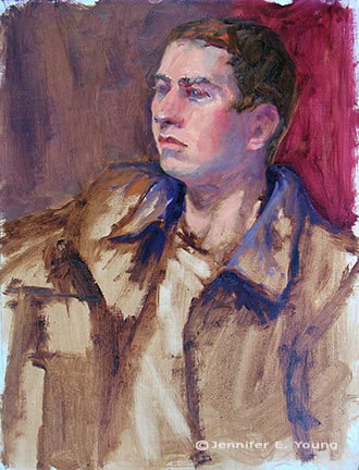
thecaptainstudy_jenniferyoung

Portrait study- "The Captain", Oil, 20x16"

I heard quite a few people calling this gentleman the Captain, but I'm not sure if they were doing so because he actually was a captain, or just looked like one! In any event, he was a riot and really seemed to get a kick out of sitting for us. He was an excellent model, able to stay still for an extraordinary amount of time (which he attributed to the fact that he was a long-time turkey hunter.)

I got a little further along with this portrait than I had done on the first day, though I think I had a bit of a handicap to overcome. I had toned this canvas rather too dark. Prior to the class we were sent instructions to tone our canvases in acrylic to a middle value gray. I'm ususally pretty good with my value judgements, but I'd not used acrylics in a long time and they seemed to dry darker than I had expected them to.

This ground had me feeling like I had to do a good deal of extra work to get rid of it so that I could acheive the fair complexion and hair of this gentleman. Normally the middle value gray would be a nice gauge  for judging mid tones, but with this model's coloration especially, the darker than mid gray tone was just not helpful.

This next portrait below was actually not done in the workshop, but comes from a session last week after I returned back home. I met up with a local portrait group that meets weekly here in Richmond. I have actually wanted to meet up with this group for quite a while but for some reason the mid-week evening sessions have not jived with my schedule. Any way, this is Joey:

"Joey" (portrait study), 16x12, oil on linen

"Joey" (portrait study), 16x12, oil on linen

Since I knew we'd only have this model for a 3 hour segment of time, I thought I'd make it a little easier on myself by choosing a smaller canvas (toned in a light wash of burnt umber, on the spot). As it turned out, I didn't get much farther with my level of finish; which is too bad because Joey had on a great oversized black leather jacket and was holding a guitar.

Nevertheless, I think this is my favorite alla prima portrait so far, as I was very happy with the likeness I was able to achieve. I went about it in the same manner as the two previous studies, using same palette as I'd used in the portrait workshop. But this one just seemed to "click" a little better. Even though that electric blue could use some toning down around his jawline, I like what's happening with the color sense and the brushwork.

I'm missing the portrait group's meeting this week because I'm going to the Shins concert (woo hoo!) but I intend to keep up with them on as regular a basis as I am able. Whether or not I ever "do anything" formally with portraiture, I've made it my goal because I'm convinced that the challenge of working from the live model will improve my abilities to render and to see light and color more accurately overall.

Alla prima portrait study

In my previous post I mentioned an out of town trip last weekend. I was over in Colonial Beach VA pursuing one of my main 2009 goals (exploring the figure) by taking another class with painter/portrait artist Robert Liberace. This class was a 2 day workshop on alla prima portrait painting. Since this is the way I am accustomed to painting with my landscapes (particularly smaller works and those done en plein air) I was really drawn to the class. Rob is as enthusiastic and energetic as I remember him to be from my first class with him in figure drawing last semester at the Art League School. I am continually enthralled by his masterful demos, and I found it interesting that the process he set forth for this style of portraiture was very similar to the method I use to paint my landscapes.

The palette we used, however, was quite a bit different and more expansive than what I typically use for my landscapes; burnt umber, cad yellow light, followed by several reds, several blues, two violets and a couple of greens. He also used two different kinds of white, Titanium (a very strong, bright white) and Lead White (the most opaque of the whites.)

Rob began with an imprimatura (toning) in burnt umber on Ampersand panel, and a very quick and sketchy (though amazingly accurate) grisaile. From there he then built his way to layers of color from shadow to mid-tone, halftone and finally highlights. Of course he made it look so easy, but I soon found out otherwise!

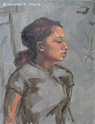
The model I painted on this first day was a very stunning young lady who looked to be about 15 or 16. Turns out she was actually only 12. I think for her age and energy level she did exceedingly well sitting for us, and it was a real visual treat to paint her. By the luck of the draw, I found myself setting up in a spot that put the model in complete profile. I'm not normally overly excited with profile views. In fact I find them boring. But the model had a great hairdo and a nice twist to her torso that actually enlivened my view and made it fun to paint:

girlportraitstudy_jenniferyoung

She was wearing a great red satin dress in the Asian style, which went well with her beautiful golden skintone and almond shaped eyes. Unfortunately in the remaining time we had left to work (after Rob's excellent demo) I got none of the dress, save for a brief outline. I did take a photo of her though, in case I decide to work more on the painting. But most times I leave my workshop studies as is, to serve as a reminder of what I learned and in what areas I still need to grow.

In any case, I  learned a lot from this first sitting. First of all, just as in plein air painting, it's important to get your drawing down accurately and commit to your big idea as soon as possible. While the lighting in a portrait studio doesn't change the way the natural light does en plein air, what does change incrementally is the model. It's really hard for a model to get the exact same pose and facial expression after a break. And it's also really hard to hold a pose for any length of time (especially if you happen to be 12 years old!) So while it's tempting to jump right in to color, Rob wanted us to spend a good deal of time first developing a strong grisaille and really fleshing out the portrait in it's proper porportion, placement, light, shadow, and halftone-- BEFORE putting down the first dab of color.

Another very important thing I learned once I moved beyond the grisaille had to do with painting children. As in landscape painting, it is oh so very easy to overdo it by getting lost in details. It's an interesting dance; because while you want to accurately record what you see, too much unnecessary detail can detract from the character of the subject and weaken the overall painting. At about an hour into my painting I was well into color, painting in every shadow I could possibly see on the model's face. I knew the likeness in her profile was pretty accurate, but still  I wasn't getting her character--her "glow".

Then Rob came by and said, "You're aging her." Taking my brush, with literally two sweeping strokes he pulled some of the middle skintone I had put down on her upper cheek and quickly swept it downward, blending away almost all of the shadow work I'd done around her mouth and nose, leaving only part of the cheekbone shadow and the shadow work I'd done under her jaw. I just stood there and chuckled. It was like one of those "miracle line eraser" wrinkle ads you see on the Internet.

"You just took 10 years off of her, " I said. Ah, if only it were that easy in real life!

p.s. The above 20x16" study was after about 2 to 2 1/2 hrs. of work. The sketch in the upper right corner of the canvas was a hands-on instructive from Rob early on, because the initial lines of my grisaille around the eyes were too juicy and lacked definition.