Carlson, trees and me

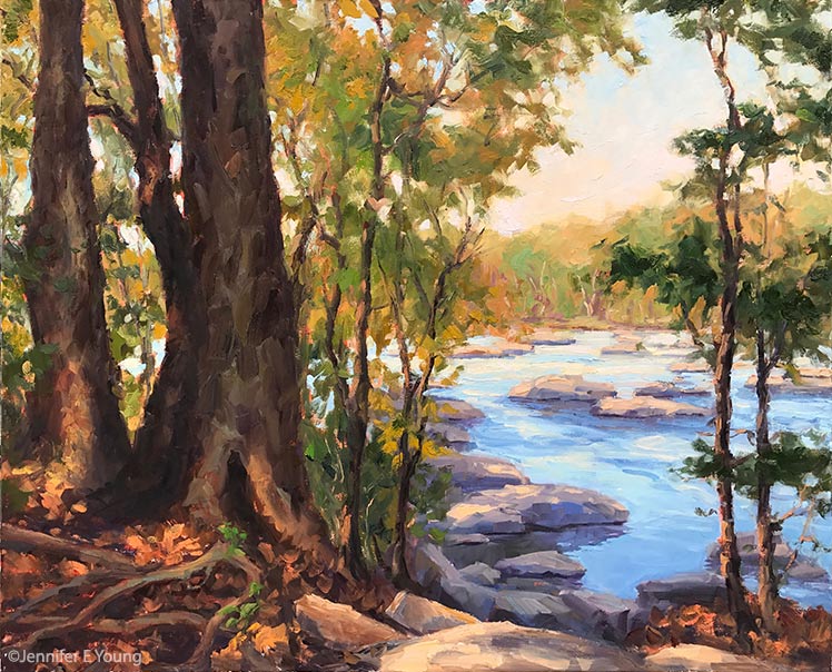
Well I really do need to stop saying I'm "back in business", because no sooner do I say it then something goes awry. Mid-way into the James River studio piece I posted about in my last blog, Ma Nature delivered to us a belated white Christmas and sub-freezing temperatures. School closed for three days (!) but in fits and starts I got 'er done.

"Take Me to the River", Oil on linen, 24x30: ©Jennifer E Young

"Take Me to the River", Oil on linen, 24x30: ©Jennifer E Young

There's quite an investment in paint in this piece, but since I was able to work at least a little bit on it each day over our surprise break, it stayed open and wet enough that I was able to work up a nice texture without the dreaded gumming up of paint that can lead to over-work. 

Lately I've been looking at and thinking a lot about one of my painting heroes, John F. Carlson. If you paint landscapes (or are the connoisseur of them), you may already know about his well-loved book "Carlson's Guide to Landscape Painting". If you haven't heard of it, I highly recommend picking up a copy if you are serious about the study of painting in this genre.

Carlson was a Swedish-American Impressionist born in 1875. His family immigrated to New York in 1884. Carlson went on to study art at the Art Students League in New York City, and achieve a fine career as a landscape painter, with prestigious exhibitions and a position as the director of the Woodstock School of Landscape Painting.

While he painted a variety of subjects, he made many powerful works based on scenes containing primarily groupings of trees. Carlson really was a master of form and negative space. The simplicity of his subject matter in many of his better-known paintings belied the abstract power of his compositions.

So in addition to thinking about light and shadow, variations in color, etc., I thought a lot about variation in shapes, both negative and positive. The James River series really does lend itself to this kind of study, as many paths to the river are wooded before you arrive at its rocky banks. Twisted roots along the forest floor add an additional element of interest to the composition. I had such a good time with this painting that I am developing a companion. More about that coming soon.

Varenna mini gouache study

Thought I'd do a little experimenting with this fun little 5x6" study in gouache.

"Colors of Varenna (study) Gouache on Cottonwood Arts Coldpress paper, 5x6" ©Jennifer Young

"Colors of Varenna (study) Gouache on Cottonwood Arts Coldpress paper, 5x6" ©Jennifer Young

Here I'm just trying to get an idea about my lights and shadows and the basic shapes, so I've not much detail. For this composition I experimented with using a compositional grid that we studied during Kevin Macpherson's workshop (you can probably make out some of it in pencil beneath the gouache. I mentioned it briefly in my last post, but basically this is a method to achieve an informal subdivision of space, as discussed in Andrew Loomis' book called Creative Illustration:

loomisgoldensection
loomisgoldensection

After I learned more about this "grid thing", I realized that I had often been using this kind of subdivision intuitively. But it is good to have a tool handy to be more deliberate about it when one wants to, or if you are dealing with a complicated subject and are trying to decide what to leave in, what to edit out, and how to arrange a painting for the most pleasing effects.

It's been a while since I have worked with gouache and had forgotten that the colors shift a bit when they dry. Nevertheless I had a good time and really look forward to working with them again.

Painting water

A reader recently asked me in my comments section about painting water, and as I am in the middle of painting Venice scenes I thought it might be good to "reflect" a bit on it here (pun intended). As we all know, pure water is transparent and has no color. It's power, pictorially speaking, lies in the colors and shapes it reflects. It's always a bit dangerous to apply too many formulas to painting, but some general guidelines are useful (just be sure to verify these with your observing eyes!)

Obviously, if you are painting a still body of water like a pond or lake that reflects the surrounding landscape, the reflected elements are upside down and reversed in the water. Reflected shapes are sometimes foreshortened, and water's movement also distorts the shapes reflected, depending on how much of a breeze or current is at play.

A common error is to paint reflected items tone for tone exactly as they appear in their solid counterparts. But unless they are in deep shadow (which does sometimes happen in the narrow canals of Venice) dark elements usually appear lighter in their reflections, and light tones appear darker. For me, painting the reflections (and especially the dark values) fairly thinly works best, as standing water has a glass-like appearance.

A common error of beginners is to paint everything reflected in horizontal strokes, and in doing so, overwork and over-blend these areas until everything is kind of a muddy mess.

I like to paint the basic value-shapes of the reflections in downward or vertical strokes first to follow the forms above, and then add strokes of movement horizontally. For detail and highlights, it's easy to "overdo" them in reflections, so take a subtle approach to start. Sometimes that is the most effective. You can always add more touches later, but it's harder to take away unless you just scrape down or wipe the whole thing clean!

Moving water like rivers, rapids and ocean waves are another thing altogether. They have their own unique properties, and probably could benefit from their own (future) post!

Some of my favorite reference sources for painting techniques regarding water (and everything else!) are the books by Emile Gruppe. Gruppe was a wonderful impressionist painter and teacher who was a part of the Cape Ann School of artists. He worked in and around Gloucester and Rockport Massachusetts. He wrote a triad of books on painting and they are all invaluable to the landscape painter.

Time and process

Well, for the most part, my resolve last week to get "back to painting" crumbled, as I found myself distracted by a number of other issues. I haven't been in the best command of the schedule I'd set up for myself, setting aside my painting time to do a million different errands and tend to personal issues as well. The tendinitis continues to bother me, too, which isn't helping my stick-to-itiveness.  In hindsight, in spite of my injuries, I  probably should have made myself stick as much as possible to the same schedule regardless of whether I'm actually "painting"-- filling the gaps with new art-related activities (like reading one of my gazillion art books!) In any event, I am starting again--finally-- with a color block-in which I'm including below:

tuscany painting in progress by Jennifer Young

Because of the shoulder/arm thing, I've had to make a few changes to the way I work so that I'm not in a huge amount of pain by the end of the day.  I've lowered my entire painting setup, paint for shorter intervals, and also set a timer when I am painting to go off every 30 minutes. It reminds me to stop and stretch and give my muscles a chance to release the locked position I tend to take when I'm hyper-focusing during painting.

Coincidentally, artist Robert Genn wrote an interesting little article last week in his twice-weekly newsletter about the timed exercises he uses for  attention and focus, (which naturally caught my attention!)  In the article, Genn suggests that by imposing shorter time limits on a work session (in his example 37 minutes), one is required to come into sharp focus, thereby energizing mind and spirit (and often one's painting as well.) I don't think Genn is suggesting that one should always commit only 37 minutes to complete a painting! Rather, these are exercises to 'shake things up' and breathe new life and energy into old, comfy work habits.

It's a good idea. And it's one I've implemented myself (thoughI used a kitchen timer rather than an elusive 37-minute hourglass.) While Genn required his students to complete small paintings in his timed exercises, I've also found that the practice works great for plein air and larger studio paintings when you want to track how long you spend working on each stage of the process.

For instance, in plein air painting, where the shifting light already imposes a certain time limitation, the amount of time you spend establishing your composition is important not only to the painting as a whole, but also because it will dictate how much time you have left for the block-in and finishing. So for a smallish painting, I might wish to limit myself to 15-20 minutes to lay in my composition- DING! And 40 minutes for a block-in-DING! That leaves another 30 minutes to (possibly) an hour to make changes, refine shapes and edges and finish before the light changes too drastically (DING! Brushes down.)

You can play around with division of time if you wish, but the result, as Genn suggests, is often that you learn to hone your focus and think better on your feet, without giving yourself the chance to "noodle around" endlessly or jump into detail  too early in the game. It helps in more ways too, than just keeping you on track. For some reason, the timer helps to address all of the canvas during each of the timed stages, thereby avoiding the tendency toget lost in only working (or overworking) one section of the painting to the sacrifice of the others. I'm not sure why this is. Maybe it's just that using the timer stage-by-stage causes you to take a more deliberate, conscious approach at each stage, making the approach more methodical by breaking things down into digestible chunks.

While the timed-stages works particularly well for plein air painting (when time is truly of the essence,) I've found the same principal can also be worthwhile when applied in the studio, either by similarly timing myself at different stages in larger pieces, or, as Genn suggests, by (attempting to) finish an entire smaller piece in a short interval, as an exercise drill or a warm-up. So I thought I'd try it for the painting above, timing the initial compositional sketch and the color block-in at 15 and 40 minutes, respectively. I don't intend to finish this piece in just an additional hour. It's a 24x30" canvas and I certainly don't want it to look completely slapdash. On the other hand, I do hope to keep it as fresh as possible to re-energize myself now that I'm getting back to work.

Of course, anything can be annoying if taken to the extreme, but I can see how using the timer periodically can serve a useful purpose. It also provides good insight for me about my process, and just how much time I am spending therein.

Reclining nude II- WIP

I started this drawing on Friday in Robert Liberace's "Exploring the Figure" drawing class at the Art League School:

reclining nude figurative drawing by Jennifer Young

The upper portion is the least resolved so far, but the whole drawing is to be developed further by a kind of push/pull method of adding and subtracting layers of charcoal, followed by highlights in white conte chalk.

Rob started the class with a beautiful demonstration inspired by the techniques of a 19th century French academic artist named Pierre Paul Prud'hon. I had not heard much about this artist, but enjoyed seeing the exquisite  reproductions that Rob shared by way of this book.

Rob made particular note of the way in which Prud'hon defined form, and his unique method of shading and highlighting. As this article by artist Rebecca Alzofon explains very well, Prud'hon had a unique method of shading--in part by creating hatch lines that followed the direction of the form, then stumping and hatching again in a similar manner with highlighting chalks. So in our class, our challenge (should we choose to accept it) is to experiment with working in a similar manner from our model. From my understanding we will work on the same pose for another two or 3 sessions.

In Rob's demonstration he used a Canson gray tinted paper (at about a value #4) which worked well, as it created a light-mid value to contrast with highlighting with white Conte. I again found myself without the proper materials to perform the task. I must have gotten an incomplete or outdated supplies list or something, but all I had was an off-white Rives BFK paper, with which I just made-do by shading with vine charcoal to give me somewhat of a "tone".  I'm not sure at this point how far I can continue developing the current drawing or if it will produce the desired effect. At some point I may just start again with the proper paper, but I'd like to at least take this a little further to see what more I can do.

It has occurred to me that this method of very refined drawing is somewhat more polished than what I'm normally drawn to. Even in the Prud'hon reproductions in the book, I found myself lingering in the passagesof his drawings that were less "finished" and showed more gesture, more of the decision making process, and more of the hand of the artist.

In my own drawing, I notice myself secretly wanting to stop before I lose too much of the gesture. This is probably because in my landscape painting I've set a goal for myself to find ways of stating things more simply...to say "more with less", so to speak and to do it a bit more loosely. At the same time, the whole reason I signed up for this class is to experiment and maybe even learn something new in the process! You can't do that if you are too beholden to your own agenda.

I've been reading a great little book right now by George Leonard called Mastery: The Keys to Success and Long-Term Fulfillment. Leonard is an aikido master so a lot of his analogies in the book are drawn from the martial arts and Zen philosophy. According to the author, one of the keys of mastery is entitled "Surrender":

"The courage of a master is measured by his or her willingness to surrender. This means surrendering to your teacher and to the demands of your discipline. It also means surrendering your own hard-won proficiency from time to time in order to reach a higher or different level of proficiency."

Hmmm. I suspect it probably also means surrendering your own agenda from time to time as well.