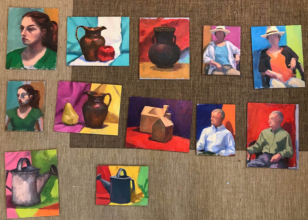
Lessons from the workshop

I thought I'd share a few of the studies I worked on during the Matt Smith workshop I posted about earlier this week. I will first preface by saying that my haste in preparing for this class came back to haunt me, so while I was well prepared in terms of my art supplies, I misunderstood what I was supposed to bring in the way of reference materials. The support documentation said to bring plein air studies and/or photos, and for some reason I took that to mean that plein air studies were preferred (maybe I was just hooked on the idea of plein air!) I probably should have asked beforehand about this because I did feel a little puzzled when I was packing about referencing a small scale plein air to make another small scale painting. (I usually translate small plein airs to larger works in the studio, but the recommended canvas sizes were all under 12x16"). In any event, I packed a number of my plein air pieces for reference, and then as a total afterthought printed off a few of my photos "just in case."

After seeing one demo and hearing the discussion though, I realized the error of my ways. I talked to Matt about what I should work from and he said he would rather see what I could do with my photo references for this class. Matt did bring a number of his own photo references for people to use, but I really dislike using other people's references. Even though we are composing with light and form, I want references that reflect my real experience of having seen (and felt) a place.  So I did what I could with what I had, but I really wished I had brought a more extensive selection of my hundreds upon hundreds of photos I have in my personal archive.

This  first painting is also the most incomplete:

In all of my paintings the common feedback from Matt was to take my brush and "knock back" some of my brushwork that competed with my statement or focal area. For instance, in this painting, our conversation went something like this:

MS:  "Is this painting about the light or shadows?" JY: "Well, I like the highlights on the edges of the poplar trees the best". And with that he took my brush and blended back the rather boisterous brushwork that was beginning to take shape in the shadow passages. MS: "You're giving equal weight to both." Next he mixed a bold tree highlight and swept it upwards on the edge of one of my poplar trees calligraphically, making the highlight really jump out. JY: "Ah, I see! But...I wouldn't just leave it like that...would I? It looks pretty unfinished." MS: "No, not necessarily. But you may restate and knock back several times before you get it right."

 I have such a love of brushwork, but it probably can work to my disadvantage sometimes. The hard part, I think, is figuring out what, exactly, is "right", and what is too little or too much. It's all about finding that balance, where active areas are juxtaposed with quiet passages. It's the quiet passages that play a supporting role and allow the more active ones to take center stage. To paraphrase something Matt said in one of his talks, it can't all be "important". Filter the noise and find the important elements.

I soon abandoned the first study, deciding to just keep that as an annotated lesson.  The second 8x10" painting below is more complete, and may look familiar to some long time blog readers. That is because I painted this scene before en plein air, and blogged about it here. The photo in the link is too dark overall but even so, I think this second study is much more infused with light. (So this exercise will be very helpful to me when I translate the concept to a larger painting, which I really am excited to do now! ) For the painting below, though,  I thought I'd try it again using just my photo reference and see what kind of feedback I could get, and whether it would look decidedly different as a result.

"Rooted II" (Study) Oil on panel, 8x10" ©Jennifer Young

"Rooted II" (Study) Oil on panel, 8x10" ©Jennifer Young

I really loved the composition as it was, so it remains relatively the same in this second attempt. But in terms of paint application,  I got some helpful hands-on feedback from Matt again. Again he took my brush and knocked back the brushwork of the distant trees to make them sit back more and look less stylized.  Fair enough. He then demonstrated "opening up the shadows, using reflected light cast from nearby objects to cast color into the shadows. He put a touch of blue, for instance, on the shadow side of the tree trunks reflecting the water, and the warmer tones reflecting warmth from the stones or earth. That was awesome. After that he showed me how an assertive hand used to apply just a few intense highlights could suddenly make the painting pop. I reworked some of what he put in but played with those general ideas. But that rim light of his along the trunk and the 3 or 4 dabs of bright green paint on the tree leaves remain just as they were applied. (And don't they just sing?)

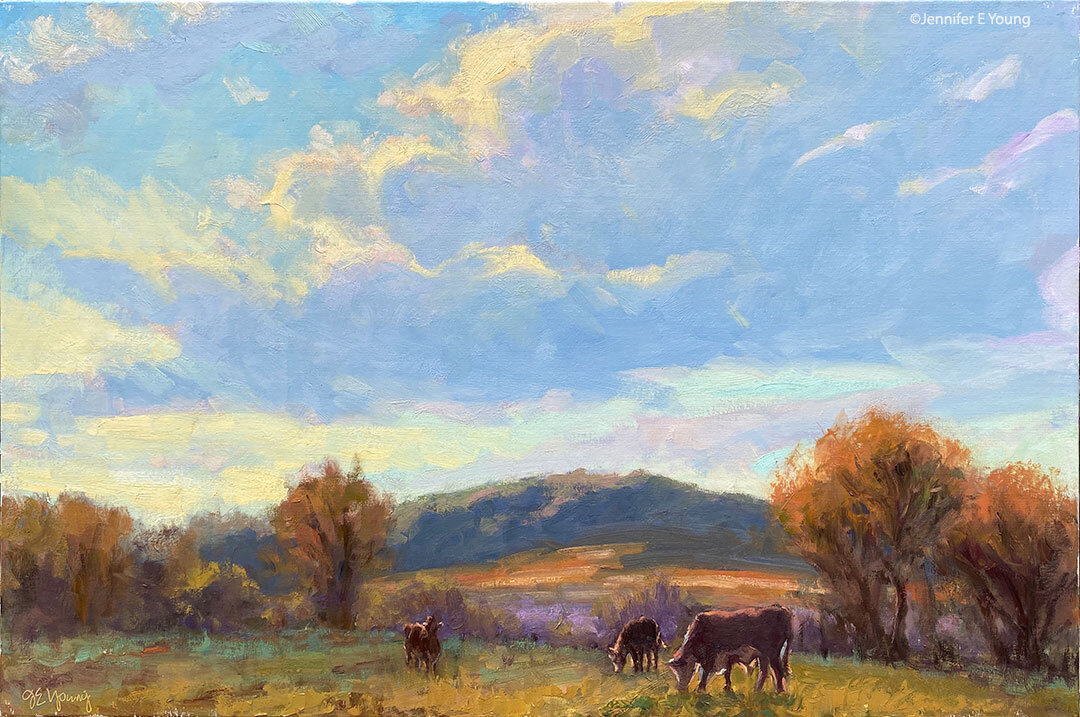
I felt I was finally getting somewhere on this final painting (below), though we had some helpful discussion early on about using perspective to direct the viewer to the focal point. He again knocked back the distant mountains with no paint, just several swift blending strokes (sigh.)  I don't consider this painting really finished either but I love the composition and I think I would like to try this again on a larger scale. It's the Dordogne as seen from the top of the Chateau de Beynac.

"Dordogne River" (Study) Oil on canvas, 9x12" ©Jennifer Young

"Dordogne River" (Study) Oil on canvas, 9x12" ©Jennifer Young

I think overall his main critique of my work was that he wanted to see both more paint and a more deliberate, assertive handling of paint. And it's really hard to do the latter without the former. As he put it, you need to have enough paint there so that it expresses the character of the medium. Otherwise you need to ask yourself, "Why are you painting in oils?"

The class was listed as an intermediate-advanced class and I felt the instruction and the students lived up to that. I left the class pretty exhausted but with a lot to think about on my 6 hour drive back home. It will be interesting to see how I can apply Matt's feedback and insights to my work, while still making my paintings "mine". Once or twice the feedback was hard, but I soon realized, as with any class, it's important to leave your ego at the door and come with an open mind if you really want to learn.

Painting water

A reader recently asked me in my comments section about painting water, and as I am in the middle of painting Venice scenes I thought it might be good to "reflect" a bit on it here (pun intended). As we all know, pure water is transparent and has no color. It's power, pictorially speaking, lies in the colors and shapes it reflects. It's always a bit dangerous to apply too many formulas to painting, but some general guidelines are useful (just be sure to verify these with your observing eyes!)

Obviously, if you are painting a still body of water like a pond or lake that reflects the surrounding landscape, the reflected elements are upside down and reversed in the water. Reflected shapes are sometimes foreshortened, and water's movement also distorts the shapes reflected, depending on how much of a breeze or current is at play.

A common error is to paint reflected items tone for tone exactly as they appear in their solid counterparts. But unless they are in deep shadow (which does sometimes happen in the narrow canals of Venice) dark elements usually appear lighter in their reflections, and light tones appear darker. For me, painting the reflections (and especially the dark values) fairly thinly works best, as standing water has a glass-like appearance.

A common error of beginners is to paint everything reflected in horizontal strokes, and in doing so, overwork and over-blend these areas until everything is kind of a muddy mess.

I like to paint the basic value-shapes of the reflections in downward or vertical strokes first to follow the forms above, and then add strokes of movement horizontally. For detail and highlights, it's easy to "overdo" them in reflections, so take a subtle approach to start. Sometimes that is the most effective. You can always add more touches later, but it's harder to take away unless you just scrape down or wipe the whole thing clean!

Moving water like rivers, rapids and ocean waves are another thing altogether. They have their own unique properties, and probably could benefit from their own (future) post!

Some of my favorite reference sources for painting techniques regarding water (and everything else!) are the books by Emile Gruppe. Gruppe was a wonderful impressionist painter and teacher who was a part of the Cape Ann School of artists. He worked in and around Gloucester and Rockport Massachusetts. He wrote a triad of books on painting and they are all invaluable to the landscape painter.

Of Paint and Palette Knives

Here is a recent message I received from a reader that I thought I other blog readers might find of interest: Q: Can you tell me if you use painting knives or if it is all done with brushes? And do you have a favorite brand of paint? -N.M

A: Hi N.M-I paint primarily with a brush, but here and there I have been using the palette knife as a painting tool (rather than just a tool for mixing). If you can get your hands on Richard Schmid's video on painting the landscape (June in particular), he has an excellent demonstration of how he uses the palette knife in his paintings. I am experimenting with his technique (as I understand it) but, not for every painting. So I wouldn't call myself a palette knife painter by any means.

As for paint brands, I'm looking at my paint bins now, and I see Winsor Newton, Gamblin, Holbein, Daniel Smith, M. Graham, Rembrandt, and Old Holland! I probably use Winsor Newton and Gamblin most often, but I have had good experiences with all of the above. I often base my decision on which brand to buy by the pigment I am after. Some pigments seem to be pretty particular to one brand. But even paints that go by the same name can vary quite a lot in hue, value, or color temperature. For instance, Winsor & Newton's Cadmium Yellow Light is warmer and I believe, a bit darker than Gamblin's, which is more lemony. That's not necessarily better or worse-- it all depends on what you're after.In any case, I make sure that I buy professional grade paints, rather than student grade. They are more expensive, but there is a big difference in quality.

I hope this helps, and happy painting!

More alla prima portraits

Following up on my previous post about the Rob Liberace's portrait workshop, I thought I'd start this entry by posting my painting from day 2 of the class. This was a very different model from the one who sat for us on the first day:

thecaptainstudy_jenniferyoung

Portrait study- "The Captain", Oil, 20x16"

I heard quite a few people calling this gentleman the Captain, but I'm not sure if they were doing so because he actually was a captain, or just looked like one! In any event, he was a riot and really seemed to get a kick out of sitting for us. He was an excellent model, able to stay still for an extraordinary amount of time (which he attributed to the fact that he was a long-time turkey hunter.)

I got a little further along with this portrait than I had done on the first day, though I think I had a bit of a handicap to overcome. I had toned this canvas rather too dark. Prior to the class we were sent instructions to tone our canvases in acrylic to a middle value gray. I'm ususally pretty good with my value judgements, but I'd not used acrylics in a long time and they seemed to dry darker than I had expected them to.

This ground had me feeling like I had to do a good deal of extra work to get rid of it so that I could acheive the fair complexion and hair of this gentleman. Normally the middle value gray would be a nice gauge  for judging mid tones, but with this model's coloration especially, the darker than mid gray tone was just not helpful.

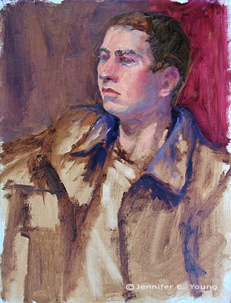
This next portrait below was actually not done in the workshop, but comes from a session last week after I returned back home. I met up with a local portrait group that meets weekly here in Richmond. I have actually wanted to meet up with this group for quite a while but for some reason the mid-week evening sessions have not jived with my schedule. Any way, this is Joey:

"Joey" (portrait study), 16x12, oil on linen

"Joey" (portrait study), 16x12, oil on linen

Since I knew we'd only have this model for a 3 hour segment of time, I thought I'd make it a little easier on myself by choosing a smaller canvas (toned in a light wash of burnt umber, on the spot). As it turned out, I didn't get much farther with my level of finish; which is too bad because Joey had on a great oversized black leather jacket and was holding a guitar.

Nevertheless, I think this is my favorite alla prima portrait so far, as I was very happy with the likeness I was able to achieve. I went about it in the same manner as the two previous studies, using same palette as I'd used in the portrait workshop. But this one just seemed to "click" a little better. Even though that electric blue could use some toning down around his jawline, I like what's happening with the color sense and the brushwork.

I'm missing the portrait group's meeting this week because I'm going to the Shins concert (woo hoo!) but I intend to keep up with them on as regular a basis as I am able. Whether or not I ever "do anything" formally with portraiture, I've made it my goal because I'm convinced that the challenge of working from the live model will improve my abilities to render and to see light and color more accurately overall.

Alla prima portrait study

In my previous post I mentioned an out of town trip last weekend. I was over in Colonial Beach VA pursuing one of my main 2009 goals (exploring the figure) by taking another class with painter/portrait artist Robert Liberace. This class was a 2 day workshop on alla prima portrait painting. Since this is the way I am accustomed to painting with my landscapes (particularly smaller works and those done en plein air) I was really drawn to the class. Rob is as enthusiastic and energetic as I remember him to be from my first class with him in figure drawing last semester at the Art League School. I am continually enthralled by his masterful demos, and I found it interesting that the process he set forth for this style of portraiture was very similar to the method I use to paint my landscapes.

The palette we used, however, was quite a bit different and more expansive than what I typically use for my landscapes; burnt umber, cad yellow light, followed by several reds, several blues, two violets and a couple of greens. He also used two different kinds of white, Titanium (a very strong, bright white) and Lead White (the most opaque of the whites.)

Rob began with an imprimatura (toning) in burnt umber on Ampersand panel, and a very quick and sketchy (though amazingly accurate) grisaile. From there he then built his way to layers of color from shadow to mid-tone, halftone and finally highlights. Of course he made it look so easy, but I soon found out otherwise!

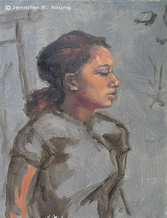
The model I painted on this first day was a very stunning young lady who looked to be about 15 or 16. Turns out she was actually only 12. I think for her age and energy level she did exceedingly well sitting for us, and it was a real visual treat to paint her. By the luck of the draw, I found myself setting up in a spot that put the model in complete profile. I'm not normally overly excited with profile views. In fact I find them boring. But the model had a great hairdo and a nice twist to her torso that actually enlivened my view and made it fun to paint:

girlportraitstudy_jenniferyoung

She was wearing a great red satin dress in the Asian style, which went well with her beautiful golden skintone and almond shaped eyes. Unfortunately in the remaining time we had left to work (after Rob's excellent demo) I got none of the dress, save for a brief outline. I did take a photo of her though, in case I decide to work more on the painting. But most times I leave my workshop studies as is, to serve as a reminder of what I learned and in what areas I still need to grow.

In any case, I  learned a lot from this first sitting. First of all, just as in plein air painting, it's important to get your drawing down accurately and commit to your big idea as soon as possible. While the lighting in a portrait studio doesn't change the way the natural light does en plein air, what does change incrementally is the model. It's really hard for a model to get the exact same pose and facial expression after a break. And it's also really hard to hold a pose for any length of time (especially if you happen to be 12 years old!) So while it's tempting to jump right in to color, Rob wanted us to spend a good deal of time first developing a strong grisaille and really fleshing out the portrait in it's proper porportion, placement, light, shadow, and halftone-- BEFORE putting down the first dab of color.

Another very important thing I learned once I moved beyond the grisaille had to do with painting children. As in landscape painting, it is oh so very easy to overdo it by getting lost in details. It's an interesting dance; because while you want to accurately record what you see, too much unnecessary detail can detract from the character of the subject and weaken the overall painting. At about an hour into my painting I was well into color, painting in every shadow I could possibly see on the model's face. I knew the likeness in her profile was pretty accurate, but still  I wasn't getting her character--her "glow".

Then Rob came by and said, "You're aging her." Taking my brush, with literally two sweeping strokes he pulled some of the middle skintone I had put down on her upper cheek and quickly swept it downward, blending away almost all of the shadow work I'd done around her mouth and nose, leaving only part of the cheekbone shadow and the shadow work I'd done under her jaw. I just stood there and chuckled. It was like one of those "miracle line eraser" wrinkle ads you see on the Internet.

"You just took 10 years off of her, " I said. Ah, if only it were that easy in real life!

p.s. The above 20x16" study was after about 2 to 2 1/2 hrs. of work. The sketch in the upper right corner of the canvas was a hands-on instructive from Rob early on, because the initial lines of my grisaille around the eyes were too juicy and lacked definition.