Oh yeah, I have a blog! ;-) Actually, I didn't forget; I've been doing a little traveling up north to the New Hope School of Art to take a workshop from the very talented painter Matt Smith. The trip was noteworthy for a number of reasons. First, it was the first time I have been away from my daughter for more than a night. (That part was hard.) But second, it was also the first time I've had in 4 years to do nothing but paint and immerse myself in "art stuff" for four days straight. (And that part, my friends, was luxurious!)
I haven't taken a workshop in a very long time. But now that my daughter is getting a little older, I really feel like it's time to amp up my art life in some significant way and infuse my work with new insights. So when I heard Matt was coming east to teach (he's based out West, so that's something I'd not caught wind of before around here) I knew it would be an excellent opportunity to do just that.

Matt hails from Arizona, and is best known as a painter of the Sonoran desert near his home, as well as the snow capped Canadian Rockies and other places out west that epitomize the classic western landscape. What initially attracted me to his work though was not his subject matter, but the sensitivity in the handling of his brushwork and edges. They are both bold and delicate at the same time. But after seeing him demo and talk about his approach, I was equally impressed by the purposeful way he composed his paintings and orchestrated his compositions to create powerful statements. I won't get into a blow by blow description of day 1-4 of class, but I will share some of the significant things I took away from it personally, most likely in more than one post.
The interesting thing about this workshop was that even though Matt is best known among artists as a plein air painter, the class was held entirely inside, in the studio. I'll be perfectly honest here and say that when I signed up for the class I was mildly disappointed that the format would not include at least part plein air painting, especially since Matt himself is a seasoned field painter and the area where the workshop was located was very scenic. (It was the birthplace, in fact, for an entire movement of landscape painters, known as The New Hope School and Pennsylvania Impressionism.) Largely though, that disappointment was entirely personal. My studio is my workhorse, but plein air painting is more exciting to me. Also with my life situation at present, I just don't get the longer stretches of time needed to trek out in the field as often to paint.
When I asked about the reason for the indoor class, Matt's response was that in his years of teaching, he has seen the same problems pop up again and again, whether in the field or in the studio. Maybe he felt it's better to address these fundamental issues in a controlled environment rather than adding another layer of difficulty with the environmental factors that plein air adds. In any event, the format turned out to be fine. In fact, there was plenty I needed to work on just with my studio work, the studio environment definitely allowed Matt to get to each student several times a day with valuable feedback. As it turned out, the weather was not great any way, and we probably would have needed to seek shelter for at least two of the four days due to rain and wind.
Matt did several very good demos (using his photo references). He used a Strada easel, which I think was a rather new purchase for him. He talked a lot about equipment and painting gear, which, as any regular reader of my blog may have surmised, is a topic of great interest to me. The Strada is made of metal and looked like a neat little box (I think his was the mini, which is presently sold out.)

But even without the two winged accessory attachments added to provide more workspace, it was a very heavy box for its size. Matt said he liked it because of its compact size (it easily fits into a backpack) and durability for travel, but personally I could not deal with the heft. A Gitzo travel tripod was also part of his setup, which looked great for its ease of use and small size when folded (also easily fitting into a backpack), but a quick Google search soon told me this item was way out of my price range. (Wowsa!)
Matt, by self-definition is not a colorist. In fact, of the fundamentals he sites as essential to a good painting (Drawing, Value, Design, and Color) the most expendable he says, is color. Even so, I found his palette fairly wide, with four blues, two earths, two yellows, an orange, one red, a violet, and a couple of greens (plus, of course, white.) He used no medium other than his oil paint and a very tiny amount of Gamsol to thin his paints.
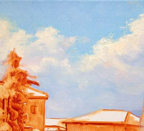
His start consists of a very light sketch, soon followed by masses of color, working broadly to get his main elements and shadows down. He then builds from there, thin to thick, dark to light, broad to more detailed. One thing I found interesting is that he almost always left his sky a white canvas until close to the very end of the process. Obviously this is working to his great advantage, but try as I might, I couldn't resist my normal method of putting the sky in early on. This was especially the case if there was any water in the landscape, as I find I need that sky information to know what's being reflected.
I've a lot more to say on the subject but I should probably try and paint something now! In my next post I'll share of few of my studies done in the workshop, as well as some valuable take-aways that I received from Matt's feedback.
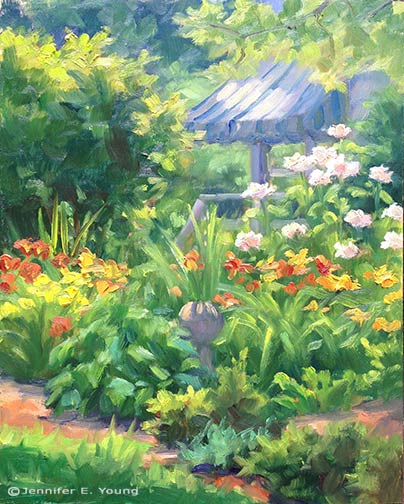


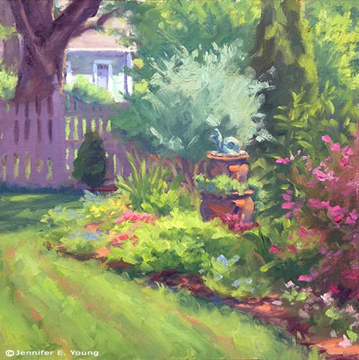 "The Curved Bed"
Oil on Canvas, 10x10"
"The Curved Bed"
Oil on Canvas, 10x10"


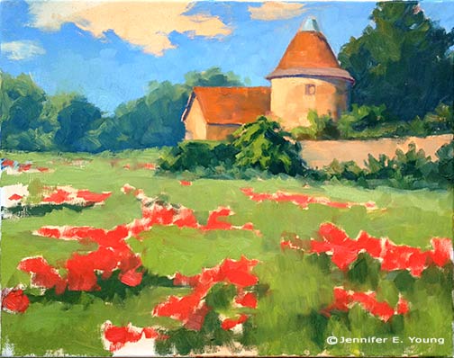
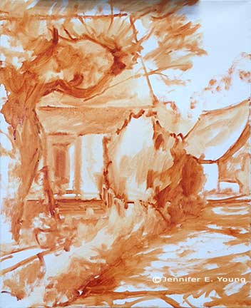
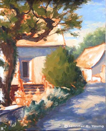
 "Shadows of Frayssinet"
Oil on linen, 20x16"
"Shadows of Frayssinet"
Oil on linen, 20x16"

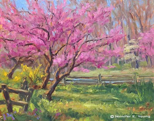 "Redbuds and Forsythia"
8x10", oil on linen
"Redbuds and Forsythia"
8x10", oil on linen

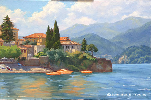
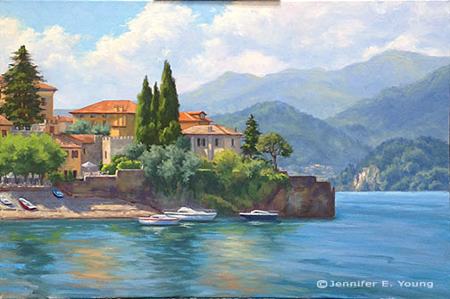

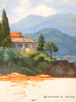

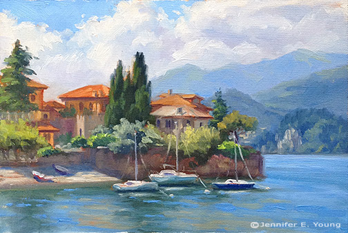 Varenna Study
Oil on canvas, 6"x9"
Varenna Study
Oil on canvas, 6"x9"
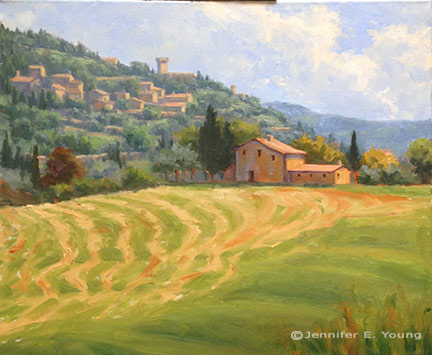


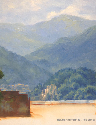
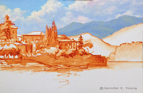
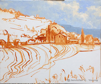 Next come the hill town and terraced hillside of the background. At this point I am still establishing the compositional elements so there is not much color or value variation. I will go back into these areas again, but I really want to develop the entire canvas to the same level before it sets up too much, as I'm not sure when my next painting session will be.
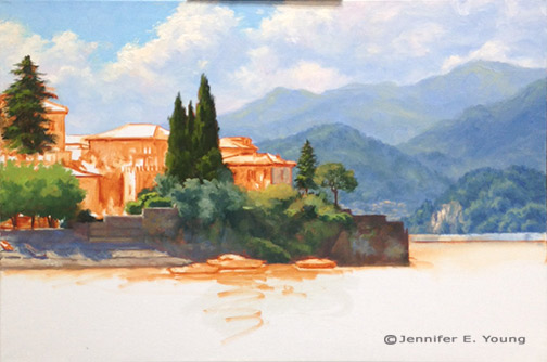
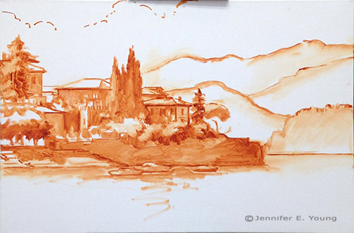
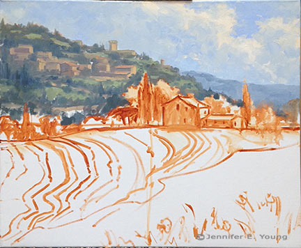 Now for the middle distance, where my area of interest (the house) resides. I decided to lower the cypress to the right of the house, as I felt there needed to be some height/shape variation in the trees flanking the house. I'll have to go back into that sky area again where I made this change to clean it up a little more. Good thing I still have plenty of that sky color on my palette! Again, I don't have much in the way of highlights yet...just a few value shifts to give certain objects a little form.
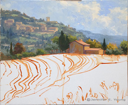 Now I'm ready to start laying in the foreground hill and those groovy hay tracks.
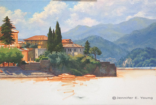
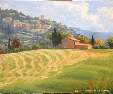 That was fun! Now I have the whole canvas covered more or less to the same level of finish. There's a good deal more to do, but this feels like a pretty good start for around 4 hours of work.


