Pescallo Cafe (in progress)

Call us crazy, but we are seriously entertaining the idea of returning to Italy next year-- with a toddler along for the ride. I am not really certain where we will go or how this will work with me painting, us touring, and one of us being only 3 1/2, but the fact that we are seriously talking about it seems fairly miraculous in and of itself. Every time I go through my photos and sketches of past travels, I end up wanting to return to this region or that region, and I am no closer to settling on a destination than when we started talking about this trip last winter. And then there are the places we haven't even gotten to yet. Each part of Italy seems to have its own alluring qualities, unique to themselves but quintessentially Italian.

Lake Como remains near the top of my list (so far) in terms of sheer beauty and aesthetic pleasure. It's not heavily endowed with art history or artifacts, (compared to, say, Rome, Florence, or Venice) but what it lacks in museums it makes up for in natural beauty and storybook enchantment.

This is a quick sketch of a composition I have been playing around with for a little while. It is of a little cafe set upon a pier in Pescallo. Not a great photo, but hopefully you get the general idea.

This was drawn to scale on my sketchpad so that when I "scale up" that there will not be a great distortion when I put it to canvas. There will still be some adjustments along the way, but by remaining in the same format, there shouldn't be any major surprises.

Here is the line composition drawn out in oil (burnt sienna) on canvas. I do some toning here to work out a value pattern, but it's not a 100% tonal drawing-- just enough to cement my concept in my mind and get me excited about the piece.

tonal sketch Lake Como cafe by Jennifer E. Young

Stay tuned for more to come soon as the painting progresses.

Sant' Antimo (Tuscany) painting complete

It took longer than I would have wanted to finalize my latest landscape painting of Tuscany, but I am really pleased with the final. Picking up from my prior post about this painting, here are a couple of additional progress shots: Continuing work to further articulate the background landscape:

pathtosantantimowip_jenniferyoung.

...and here I begin to work on the Abbey:

pathtosantantimowip2_jenniferyoung

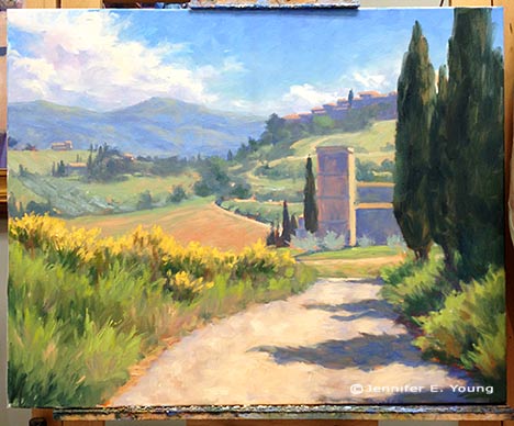
Here, at last, is the final!

"Path to Sant' Antimo" Oil on Linen, 24x30" ©Jennifer Young

"Path to Sant' Antimo" Oil on Linen, 24x30" ©Jennifer Young

Sant' Antimo Abbey is a beautiful Romanesque (formerly Benedictine) monastery dating back to the 1100's. It is situated in the stunning landscape of the Montalcino commune, and rests about 10 km from the town of Montalcino, (home of the gorgeous Rosso di Montalcino and Brunello wines).

In springtime the landscape of Montalcino and surrounds are strewn with poppies and other wildflowers, and the hillsides are often touched with the soft yellows and greens of golden broom.

I have a lot of reference photos of this abbey from my visit there several years ago. But I particularly like this view, which shows the focal point as a hint of the abbey in its lovely setting, but doesn't scream "portrait of a building". I also enjoy the point of view, which puts the viewer firmly on the pathway beneath the tall cypress trees, and nearly eye level with the abbey, adding to the sense of "being there".

Sant' Antimo painting W.I.P. (cont'd)

I thought I would share a progress shot of the painting of the Montalcino valley (Tuscany) I've been working on. I have been under the weather, which delayed my progress for a few days. But now I think I'm getting back on track.

Tuscany landscape painting in progress by Jennifer Young

I now have the whole canvas more or less blocked in. I decided to remove the tree foliage that I'd indicated  in front of the abbey because I felt it hindered rather than added interest. I had to refer to a few other photos I had taken from different angles to figure out what is behind there, but I think the change opens it up a bit and things make more sense overall. I hope soon to be able to share the final piece....I'm getting closer!

Painting water

A reader recently asked me in my comments section about painting water, and as I am in the middle of painting Venice scenes I thought it might be good to "reflect" a bit on it here (pun intended). As we all know, pure water is transparent and has no color. It's power, pictorially speaking, lies in the colors and shapes it reflects. It's always a bit dangerous to apply too many formulas to painting, but some general guidelines are useful (just be sure to verify these with your observing eyes!)

Obviously, if you are painting a still body of water like a pond or lake that reflects the surrounding landscape, the reflected elements are upside down and reversed in the water. Reflected shapes are sometimes foreshortened, and water's movement also distorts the shapes reflected, depending on how much of a breeze or current is at play.

A common error is to paint reflected items tone for tone exactly as they appear in their solid counterparts. But unless they are in deep shadow (which does sometimes happen in the narrow canals of Venice) dark elements usually appear lighter in their reflections, and light tones appear darker. For me, painting the reflections (and especially the dark values) fairly thinly works best, as standing water has a glass-like appearance.

A common error of beginners is to paint everything reflected in horizontal strokes, and in doing so, overwork and over-blend these areas until everything is kind of a muddy mess.

I like to paint the basic value-shapes of the reflections in downward or vertical strokes first to follow the forms above, and then add strokes of movement horizontally. For detail and highlights, it's easy to "overdo" them in reflections, so take a subtle approach to start. Sometimes that is the most effective. You can always add more touches later, but it's harder to take away unless you just scrape down or wipe the whole thing clean!

Moving water like rivers, rapids and ocean waves are another thing altogether. They have their own unique properties, and probably could benefit from their own (future) post!

Some of my favorite reference sources for painting techniques regarding water (and everything else!) are the books by Emile Gruppe. Gruppe was a wonderful impressionist painter and teacher who was a part of the Cape Ann School of artists. He worked in and around Gloucester and Rockport Massachusetts. He wrote a triad of books on painting and they are all invaluable to the landscape painter.

Blue Ridge Mountains Commission- WIP, cont'd

This week I continued work on the mountain meadow commission painting I began blogging about in my last post. My approach for this piece seems to be that I am working more or less from back to front, as edges are softer farther away and come into greater focus in the foreground. The sky is painted together with the distant mountains, since there is such an interplay of clouds and mist back there. The distant trees are addressed rather uniformly at this point, as I tweak their values and placement in the composition.

Blue Ridge Mountain Meadow Commission- WIP

Next I decide to address the darkest value in the painting, which is the focal tree, so that I can better assess the value relationships as a whole. I am not getting into the tree edges yet, as I need some of the meadow colors laid down first in order to create the soft edges of a misty morning.

Jennifer Young Morning Meadow commissioned painting in progress

Next I mass in very generally the flowers in the field. There will be a lot more color variation but I just want to get the generalized color and pattern down on the canvas first.

Jennifer Young Morning Meadow painting commission- WIP

Soft greens of the grasses follow the blue, and merge to soften the edges further.

Jennifer Young painting commission

With the field of the meadow laid in, I can now start to give the focal tree a nicer shape, with soft lacy edges and a few subtle tree holes. I may need to tease out those holes a little further, perhaps darken them a bit, so that they aren't so "holey", but now I can see the  painting really start to take shape.

Jennifer Young mountain landscape painting in progress

The sky has gotten washed out in the photo above, but I will try to get a better shot with different lighting conditions. It's been raining and cloudy a lot lately, so I am relying on indoor lighting (which isn't all that reliable!) What comes next will be more work on that field. Both grasses and flowers are cooler and softer as they recede, and show more detail, warmth,  color intensity and contrast as they come forward.