Dusk Approaches

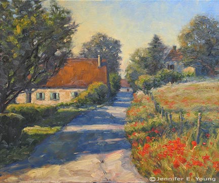
If you're tired of French paintings, don't read this post! I've been on a roll. Here's another one of the Dordogne, with my favorite light and a play of long shadows:

"Dusk Approaches" Oil on Linen, 20x24" (SOLD) ©Jennifer Young

"Dusk Approaches" Oil on Linen, 20x24" (SOLD) ©Jennifer Young

The paint is thick and it's still a bit soft, but if it sets up enough to receive a retouch varnish, I may include it my show of French works that opens next week. This new piece was done on a rather rougher weave linen than I'm accustomed to using, but since I'm trying to economize, I'm working my way through the art supplies I have on hand (rather than just ordering more of my 'preferred' materials.)

The linen is a quality product, just not as fine a weave as I normally like; so up to now these canvases have been collecting dust. It came stretched and pre-primed, but I did add a couple of extra coats of gesso beforehand (with sanding in between) which helped to smooth the surface a little. But still its grip on the paint was significant, so some use of the palette knife came in mighty handy.

French market painting #2

Here is something of a companion piece to the other Cahors market painting I posted a couple of days ago:

"Legumes du Jour" Oil on Linen, 20x16" (SOLD) ©Jennifer Young

"Legumes du Jour" Oil on Linen, 20x16" (SOLD) ©Jennifer Young

For both this painting and the previous market painting I have again experimented with a single primary palette of just 3 colors (red, yellow, and blue) plus white. I don't normally use a huge palette any way, but sometimes I feel I can become over-reliant on certain colors. Using a very limited palette helps me to feel as if I am taking back in control of my color mixing and really forces me to think more about color relationships. It also pretty much ensures more unified color. My three primaries for these two paintings were cadmium yellow pale, cadmium red medium, and ultramarine blue, and the white was titanium.

More alla prima portraits

Following up on my previous post about the Rob Liberace's portrait workshop, I thought I'd start this entry by posting my painting from day 2 of the class. This was a very different model from the one who sat for us on the first day:

thecaptainstudy_jenniferyoung

Portrait study- "The Captain", Oil, 20x16"

I heard quite a few people calling this gentleman the Captain, but I'm not sure if they were doing so because he actually was a captain, or just looked like one! In any event, he was a riot and really seemed to get a kick out of sitting for us. He was an excellent model, able to stay still for an extraordinary amount of time (which he attributed to the fact that he was a long-time turkey hunter.)

I got a little further along with this portrait than I had done on the first day, though I think I had a bit of a handicap to overcome. I had toned this canvas rather too dark. Prior to the class we were sent instructions to tone our canvases in acrylic to a middle value gray. I'm ususally pretty good with my value judgements, but I'd not used acrylics in a long time and they seemed to dry darker than I had expected them to.

This ground had me feeling like I had to do a good deal of extra work to get rid of it so that I could acheive the fair complexion and hair of this gentleman. Normally the middle value gray would be a nice gauge  for judging mid tones, but with this model's coloration especially, the darker than mid gray tone was just not helpful.

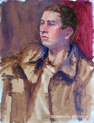
This next portrait below was actually not done in the workshop, but comes from a session last week after I returned back home. I met up with a local portrait group that meets weekly here in Richmond. I have actually wanted to meet up with this group for quite a while but for some reason the mid-week evening sessions have not jived with my schedule. Any way, this is Joey:

"Joey" (portrait study), 16x12, oil on linen

"Joey" (portrait study), 16x12, oil on linen

Since I knew we'd only have this model for a 3 hour segment of time, I thought I'd make it a little easier on myself by choosing a smaller canvas (toned in a light wash of burnt umber, on the spot). As it turned out, I didn't get much farther with my level of finish; which is too bad because Joey had on a great oversized black leather jacket and was holding a guitar.

Nevertheless, I think this is my favorite alla prima portrait so far, as I was very happy with the likeness I was able to achieve. I went about it in the same manner as the two previous studies, using same palette as I'd used in the portrait workshop. But this one just seemed to "click" a little better. Even though that electric blue could use some toning down around his jawline, I like what's happening with the color sense and the brushwork.

I'm missing the portrait group's meeting this week because I'm going to the Shins concert (woo hoo!) but I intend to keep up with them on as regular a basis as I am able. Whether or not I ever "do anything" formally with portraiture, I've made it my goal because I'm convinced that the challenge of working from the live model will improve my abilities to render and to see light and color more accurately overall.

Alla prima portrait study

In my previous post I mentioned an out of town trip last weekend. I was over in Colonial Beach VA pursuing one of my main 2009 goals (exploring the figure) by taking another class with painter/portrait artist Robert Liberace. This class was a 2 day workshop on alla prima portrait painting. Since this is the way I am accustomed to painting with my landscapes (particularly smaller works and those done en plein air) I was really drawn to the class. Rob is as enthusiastic and energetic as I remember him to be from my first class with him in figure drawing last semester at the Art League School. I am continually enthralled by his masterful demos, and I found it interesting that the process he set forth for this style of portraiture was very similar to the method I use to paint my landscapes.

The palette we used, however, was quite a bit different and more expansive than what I typically use for my landscapes; burnt umber, cad yellow light, followed by several reds, several blues, two violets and a couple of greens. He also used two different kinds of white, Titanium (a very strong, bright white) and Lead White (the most opaque of the whites.)

Rob began with an imprimatura (toning) in burnt umber on Ampersand panel, and a very quick and sketchy (though amazingly accurate) grisaile. From there he then built his way to layers of color from shadow to mid-tone, halftone and finally highlights. Of course he made it look so easy, but I soon found out otherwise!

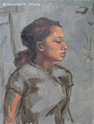
The model I painted on this first day was a very stunning young lady who looked to be about 15 or 16. Turns out she was actually only 12. I think for her age and energy level she did exceedingly well sitting for us, and it was a real visual treat to paint her. By the luck of the draw, I found myself setting up in a spot that put the model in complete profile. I'm not normally overly excited with profile views. In fact I find them boring. But the model had a great hairdo and a nice twist to her torso that actually enlivened my view and made it fun to paint:

girlportraitstudy_jenniferyoung

She was wearing a great red satin dress in the Asian style, which went well with her beautiful golden skintone and almond shaped eyes. Unfortunately in the remaining time we had left to work (after Rob's excellent demo) I got none of the dress, save for a brief outline. I did take a photo of her though, in case I decide to work more on the painting. But most times I leave my workshop studies as is, to serve as a reminder of what I learned and in what areas I still need to grow.

In any case, I  learned a lot from this first sitting. First of all, just as in plein air painting, it's important to get your drawing down accurately and commit to your big idea as soon as possible. While the lighting in a portrait studio doesn't change the way the natural light does en plein air, what does change incrementally is the model. It's really hard for a model to get the exact same pose and facial expression after a break. And it's also really hard to hold a pose for any length of time (especially if you happen to be 12 years old!) So while it's tempting to jump right in to color, Rob wanted us to spend a good deal of time first developing a strong grisaille and really fleshing out the portrait in it's proper porportion, placement, light, shadow, and halftone-- BEFORE putting down the first dab of color.

Another very important thing I learned once I moved beyond the grisaille had to do with painting children. As in landscape painting, it is oh so very easy to overdo it by getting lost in details. It's an interesting dance; because while you want to accurately record what you see, too much unnecessary detail can detract from the character of the subject and weaken the overall painting. At about an hour into my painting I was well into color, painting in every shadow I could possibly see on the model's face. I knew the likeness in her profile was pretty accurate, but still  I wasn't getting her character--her "glow".

Then Rob came by and said, "You're aging her." Taking my brush, with literally two sweeping strokes he pulled some of the middle skintone I had put down on her upper cheek and quickly swept it downward, blending away almost all of the shadow work I'd done around her mouth and nose, leaving only part of the cheekbone shadow and the shadow work I'd done under her jaw. I just stood there and chuckled. It was like one of those "miracle line eraser" wrinkle ads you see on the Internet.

"You just took 10 years off of her, " I said. Ah, if only it were that easy in real life!

p.s. The above 20x16" study was after about 2 to 2 1/2 hrs. of work. The sketch in the upper right corner of the canvas was a hands-on instructive from Rob early on, because the initial lines of my grisaille around the eyes were too juicy and lacked definition.

Southern France painting demo continues

This post continues a demo I started last week. To start from the beginning, click here!

Before going too much further I like to get a good feel for my area of interest, so I lay in the general colors and highlights of the wall of the Abbey ruins. I've worked wet into wet to blend the purple shadow colors with the warm local colors of the Abbey wall, which gives me a nice mixture of golds, browns and muted violets.

Landscape painting demo by Jennifer Young

At this point I am ready to dig in to the rest of the landscape and get that canvas covered. To keep the flow going, I try not to be "stingy with my paint". For this painting I'm using a somewhat more expanded palette than I do when I paint on location.

oil painting demo by Jennifer Young

I  want to have large enough puddles of the colors I see so that I don't have stop every five seconds to mix up more paint. This process is pretty organic so it's difficult to give a step by step process of mixing colors. In addition to blending paint wet-into-wet on the canvas, I also tend to dip into various larger puddles to make new blends as I go along. The most important thing during this process is just to compare one color, one value to the others, constantly asking myself, "Darker or lighter? Warmer or Cooler?"

french landscape painting demonstration by Jennifer Young

I also decide to indicate the basic iris colors so that I know where I'm at. I have to be careful here--even the middle value of the purple/blue flowers has a lot of white in it, so I really don't want to paint these too thickly or it will be hard to control the darks, making them muddy and less pure. A lot of these preliminary iris lay-ins will need to be restated, and, of course defined, but I felt like I wanted some indication of them in there at this point so I wouldn't get lost (if that makes any sense!)

painting demonstration by Jennifer Young

Here you can see that I've continued on working my way down the canvas so that eventually everything is pretty well laid in. I've held off putting down much of my strongest highlights. That will be among my next steps, along with further refining, defining, tweaking, and adjusting.

paintings of France by Jennifer Young

Up to this point I have used just a few brushes. Aside from the one round I used for the linear drawing of my composition in the earliest stages, I've used my larger flats and filberts. Being the very messy painter that I am, I can't tell you the size numbers of any of these, as there is old smeared paint on all of my handles, completely obscuring any info that once was printed on them! I think probably the smallest in use is around an 8 or 10(flat) but the ones I used the most were the largest filberts I have, with widths ranging from 1 and 1/4" to 1 and 3/4". I love these large filberts, as you get a nice thin edge at the tip and a broad flat side too, making them very versatile for my purposes. I could even stand to go to a larger size brush for this size painting, but I need to conserve my expenses so I'm trying to use what I have on hand right now. Even so, if I use the broad side of the brushes I can get a pretty broad and loose stroke and avoid getting too fussy with too many details too early!

landscape oil painting demonstration by Jennifer Young

To be continued...