Clean your brushes

For a painter, this guidance is akin to Mom telling you to eat your vegetables , and every artist knows this is the right thing to do. Do I do it? Not as often or as thoroughly as I should. It's my dirty little secret. I do treat my sables a bit better, but my bristle brushes take some abuse. I am trying to do better, but even after all of these years, I'm not quite there yet. The proper approach to brush care is to give your brushes a good rinse in solvent (for oil painting brushes) followed by a wash from the ferrules down to the tip with a brush cleaner or dish soap, pushing the remaining paint out as you go. Once thoroughly rinsed, push the remaining water out and reshape with your fingers and just a dab of the brush soap, or just with water and leave to dry.

Don't leave your brushes head down in paint thinner (I used to do that). The bristles will lose their shape sooner and eventually the ferrule will loosen from the wood handle and fall off. Don't leave them head down in oil either (that's what I often do now- walnut oil- especially if I plan to return to the easel the very next day). Better but still not the best practice is to rinse out with oil and then paint thinner, and wipe clean with paper towels and reshape (this I do most often). When I do wash my brushes, I like Master's brush soap. It does a good job of getting off dried paint, which happens often enough with delinquents like me. Nevertheless, once the damage has been done, the shape of your brushes will never be the same. So save yourself a lot of time and money by doing it right the first time.

P.S. And while you're at it, would it kill you to clean your palette every once in a while?

oil painting materials

Touring Venice

There are some times when my habit of waking at 5:30 a.m. (on the dot, and usually no matter what!) comes in pretty handy. With family visiting these last 10 days, early mornings have allowed me a few hours each day to complete this new Venice piece:

Venice Italy gondola painting by Jennifer E. Young

"Touring Venice" Oil on linen, 24x20"

This painting ( the bones of which you can see here) is the same size and format as the other recent Venice painting I posted a couple of weeks ago. They are meant to serve as companions to each other, though I think either would work just as well on its own.

In all the times I have been to Venice, I have still never taken a gondola ride. I wonder if it's possible to paint en plein air while aboard a gondola? A girl can dream...

More Venice, on the easel

I have a new Venice painting in the works this week. Here is the composition sketched in with thinned down burnt sienna. I have a lot of family visiting right now so any painting on this will need to happen in the wee hours of the morning this week before people start stirring. I doubt I will be able to do much blogging about its progress given my time constraints, but you never know. It's another 24"x20", to (hopefully) serve as a companion to the other Venice piece just completed.

20130610-150100.jpg

Painting water

A reader recently asked me in my comments section about painting water, and as I am in the middle of painting Venice scenes I thought it might be good to "reflect" a bit on it here (pun intended). As we all know, pure water is transparent and has no color. It's power, pictorially speaking, lies in the colors and shapes it reflects. It's always a bit dangerous to apply too many formulas to painting, but some general guidelines are useful (just be sure to verify these with your observing eyes!)

Obviously, if you are painting a still body of water like a pond or lake that reflects the surrounding landscape, the reflected elements are upside down and reversed in the water. Reflected shapes are sometimes foreshortened, and water's movement also distorts the shapes reflected, depending on how much of a breeze or current is at play.

A common error is to paint reflected items tone for tone exactly as they appear in their solid counterparts. But unless they are in deep shadow (which does sometimes happen in the narrow canals of Venice) dark elements usually appear lighter in their reflections, and light tones appear darker. For me, painting the reflections (and especially the dark values) fairly thinly works best, as standing water has a glass-like appearance.

A common error of beginners is to paint everything reflected in horizontal strokes, and in doing so, overwork and over-blend these areas until everything is kind of a muddy mess.

I like to paint the basic value-shapes of the reflections in downward or vertical strokes first to follow the forms above, and then add strokes of movement horizontally. For detail and highlights, it's easy to "overdo" them in reflections, so take a subtle approach to start. Sometimes that is the most effective. You can always add more touches later, but it's harder to take away unless you just scrape down or wipe the whole thing clean!

Moving water like rivers, rapids and ocean waves are another thing altogether. They have their own unique properties, and probably could benefit from their own (future) post!

Some of my favorite reference sources for painting techniques regarding water (and everything else!) are the books by Emile Gruppe. Gruppe was a wonderful impressionist painter and teacher who was a part of the Cape Ann School of artists. He worked in and around Gloucester and Rockport Massachusetts. He wrote a triad of books on painting and they are all invaluable to the landscape painter.

Under the Bridge

Well, instead of blogging I have been tearing my hair out trying to figure out why my blog's RSS feed has not been updating. As a result, I did not get to do any progress blogging on this painting. But here it is, a new Venice painting that I managed to complete in between the hours of frustration:

Venice, Italy painting by Jennifer Young

"Under the Bridge, Venice" 24x20", Oil on Linen

I was going through my archives of former paintings and found a little painting I had done a while back of a single boat beneath a lovely footbridge. I thought it might be nice to expand on that idea on a 24x20" canvas. I really enjoyed creating this new piece. While the boat is still featured, I was able to add a little more context and show more of the background. I really thought I would hate painting those rails, but once I figured out the design and started painting in the highlights, I rather had a good time.

As for my feed, we are still trying to figure out the best solution (though it will definitely not be feedburner!) If you are an email subscriber and received this post in your email box, then I've made progress, at least. If not, there's probably a bit more hair-pulling in my future.

Feed problems? RSS readers take note!

It  appears that my last post on my recent wine label commission isn't appearing in my RSS feed, and thus, didn't get disseminated to my email subscribers either. As I am really excited to share this project, and I'd like to get to the bottom of this problem I am having with my blog feed, I hope you will forgive me if I send out this test post. I'm trying to see if there was just some sort of formatting issue with the last post or if indeed it is true that Google is no longer supporting Feedburner (which is where my blog feed gets redirected and disseminated.) Either way, I think the writing is on the wall and it is time to find a new solution to manage my blog subscriptions.

So change is in the air. I'm still trying to figure out the best way to do this, but my plan is to leave Feedburner altogether and just start using my original feed. If you currently subscribe to my blog using RSS, please change your feed subscription to link directly to my original feed:

http://www.jenniferyoung.com/blog/feed

If you subscribe to my blog by email, there should be nothing you need to do at present with your subscription (so long as I do this right!) But if there is any change, I will be sure to notify you in advance. I don't have an enormous subscriber list, but I will do what I can to keep every one of you!

In the meantime, if you would like to see the Tuscany paintings I did for Frances Mayes' Tuscan Sun Winesfollow this link!

Commissioned paintings for Frances Mayes' Tuscan Sun Wines

Speaking of commissions, I thought I would share a few details of what for me was a rather exciting (and consuming) commission this past winter:

Italy painting for Frances Mayes' Tuscan Sun Wine labels

Tuscan Sun Wines, LLC of Denver, Colorado, commissioned me to create seven paintings of the Italian countryside for their exclusive use on a new line of wine labels for writer Frances Mayes, author of Under the Tuscan Sun.

Tuscany painting for Frances Mayes' Tuscan Sun Wine labels

 Tuscany painting for Frances Mayes Tuscan Sun Wine labels

Tuscany painting for Frances Mayes' Tuscan Sun Wine labels

Tuscany painting for Frances Mayes Tuscan Sun Wine labels

Each of the seven oil paintings portrays a theme that is central to life in Cortona, Tuscany and “Bramasole,” Mayes villa made famous by Under the Tuscan Sun. Listed here are pictures of my favorite pieces completed for this project. If you follow this link it will take you to the wine distributors website where you can see how the paintings look on finished labels!

Commission complete

Next week marks the end of preschool until the fall for my little girl, so in addition to a number of other things happening on the art biz end,  I've been scrambling to make some summer arrangements so that I can continue to paint, at least on a part time basis. But I did manage to finish the commission last week and wanted to pop in briefly to share the final. With the bones pretty well laid out in my last post, it was a matter of addressing the foreground field of flowers and grasses, and softening an edge here and there in the distance. The sky is still looking more washed out in the photo than in the original, but it's pretty close. The painting is complete and the final approved by the client, so now I am just waiting for it to dry to the touch so that I can put a retouch varnish on it prior to sending it off to its new home!

Blue Ridge Mountain painting by Jennifer E. Young

"Morning Meadow II" (commissioned painting) Oil on Linen, 16x20"

SOLD!

Blue Ridge Mountains Commission- WIP, cont'd

This week I continued work on the mountain meadow commission painting I began blogging about in my last post. My approach for this piece seems to be that I am working more or less from back to front, as edges are softer farther away and come into greater focus in the foreground. The sky is painted together with the distant mountains, since there is such an interplay of clouds and mist back there. The distant trees are addressed rather uniformly at this point, as I tweak their values and placement in the composition.

Blue Ridge Mountain Meadow Commission- WIP

Next I decide to address the darkest value in the painting, which is the focal tree, so that I can better assess the value relationships as a whole. I am not getting into the tree edges yet, as I need some of the meadow colors laid down first in order to create the soft edges of a misty morning.

Jennifer Young Morning Meadow commissioned painting in progress

Next I mass in very generally the flowers in the field. There will be a lot more color variation but I just want to get the generalized color and pattern down on the canvas first.

Jennifer Young Morning Meadow painting commission- WIP

Soft greens of the grasses follow the blue, and merge to soften the edges further.

Jennifer Young painting commission "Morning Meadow" WIP

With the field of the meadow laid in, I can now start to give the focal tree a nicer shape, with soft lacy edges and a few subtle tree holes. I may need to tease out those holes a little further, perhaps darken them a bit, so that they aren't so "holey", but now I can see the  painting really start to take shape.

Jennifer Young mountain landscape painting in progress

The sky has gotten washed out in the photo above, but I will try to get a better shot with different lighting conditions. It's been raining and cloudy a lot lately, so I am relying on indoor lighting (which isn't all that reliable!) What comes next will be more work on that field. Both grasses and flowers are cooler and softer as they recede, and show more detail, warmth,  color intensity and contrast as they come forward.

A spring commission

With the spring shows hung and the winter commission complete, I was thinking I would be able to turn next to some plein air painting, or perhaps to develop a couple of my James River plein air paintings into larger studio works. But that will have to wait, as I have gotten another commission! :-) 
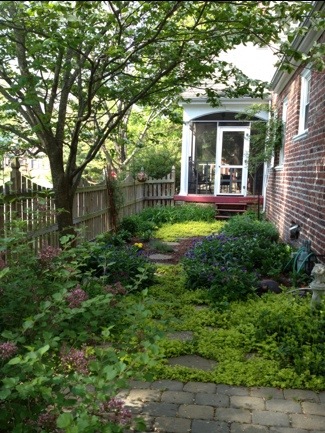
But first, a couple of shots of the garden, which, when last photographed was in a state of sad dishevelment! The gardens around the studio really come into greater color in the summer. But with the rubbish cleared and weeds pulled, things are coming alive in the side garden with Creeping Jenny on the path, flanked by Mountian Bluets (Bachelor's Buttons) and creeping phlox. A flowering Dogwood makes a nice canopy, and the lilac in the fore is just starting to put off its heady scent.

20130427-063451.jpg Here's another shot below of the garden opposite the studio. In summer there are lilies, cone flowers, tall phlox and a butterfly bush. But my big thing lately is succulents. I love that they are water-wise and so marvelously sculptural. In the center is a succulent topiary I made last year. I will need to replenish a few of the tender plants that didn't survive our winter, but it hasn't been quite warm enough here to see much variety in the garden centers yet.

20130427-063539.jpg

Now that my daughter is a toddler, I can usually patch together enough time to noodle in the garden while she plays nearby. Working in the studio is a different story. At just 2 1/2 years old, her attention span is still pretty limited. So while she loves being in the studio, (and I love having her there,) I do have to shoo her out when it comes time to work, amidst howls of protest (and a certain amount of Mommy guilt as well).

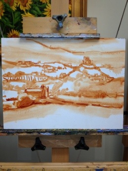
...Which leads me to the commission! If you have been a reader for some time, this image might be familiar to you. In fact, I have painted variations of this scene a few times, beginning with the small painting done en plein air in the Blue Ridge mountains, and following with two larger 30x40 versions.

The commission came about as the result of my April show currently taking place at Design Domaine Gallery in Bernardsville, New Jersey. The client loved the painting "Morning Meadow" (click here to read my blog about this painting in the making) but it was much too large for her space. So my task is to recreate this scene in a 16x20 format.

Since a 30x40" painting doesn't exactly scale down to 16x20", we thought it best to start with a sketch of the new painting so that the client could have a visual idea of how it would look compositionally.

20130427-063621.jpg

While on the one hand, it may seem easier to recreate something I have basically already done a number of times, it can sometimes be a challenge to meet client expectations. Sometimes, though not always, a client may, for instance, expect the new painting to be exactly like the first, only smaller. So an effort always has to be made to explain in advance that as an original work of art, a painting can't be recreated stroke-for-stroke like the last.

The client does understand this, though she would like the color of the new piece to be as close as possible to the last. It was, after all, the combination of colors in Morning Meadow that she fell in love with.

Luckily, my prior blog post listed the exact color palette I used to create the larger piece! :) (I can't tell you how often I have referenced my own blog to get this kind of historical information.) So while I won't be able to remember exactly the combinations of color mixtures, I will be able to take some of the guesswork out of the process and use the same palette for this piece.

20130427-063635.jpg

Above is the sketch, reinterpreted onto canvas. At this point in sketch stage, I want to make sure I get an accurate placement for the various elements in the composition, so I've marked off in pencil the horizontal and vertical mid-points in the pencil sketch as well as on the painting to guide me. More to come in an upcoming post, where I will get into some color!

Artist talk and reception this Tuesday

Just a quick post to announce an artist talk I will be giving this Tuesday, April 23rd, at 10 a.m., at Westminster Canterbury's Sarah Belle November Theatre in Richmond, VA. This will be an interview styled talk illustrated with a slide show, with questions opening up to the audience afterwards. The talk is in conjunction with the exhibition of my work hanging in the neighboring galleries. Reception immediately follows in the exhibit space located in the H. Scott November Gallery. Please call the cultural art center at 264-6268 for more information. Both the talk and the reception are open to the public, so if you are in Richmond, I hope you will consider coming out!

Two feature shows opening this month

Happy April everyone! Even though its still pretty chilly around here in Richmond, the birds are back and early spring blooms are everywhere. My garden, however, is still pretty much a mess. Old growth covers new, and even though it's driving me crazy to have it look like that, I haven't had time to deal with it.

That's my cat Olive in the background, looking at me with mild disdain.

My studio is looking like it is following suit as well.

This is my framing table. I'm too embarrassed to show you what the rest of the studio looks like right now!

Not exactly "Martha Stewart Living".   But I have an excuse.  I have been busy framing and shipping paintings for two feature shows in April. First, in Bernardsville, New Jersey, I am April's featured artist at Design Domaine Gallery. On view are a collection of my paintings from Europe and the American South. If you are up that way, stop in tonight, April 5th, for a wine and cheese reception from 6 to 9 PM., and say hi to owners Larry and Marilyn Rosenthal. Thanks Larry and Marilyn for featuring my paintings!

Another sizable exhibit of my work has just been installed at the H. Scott November Gallery at Westminster Canterbury here good ole RVA. This beatuiful exhibition space features rotating quarterly shows of artists from throughout Virginia. On view from now until June are my paintings of the French and Italian countryside. There will be a reception and artist Q&A later in the month on April 23rd. I am so happy and honored to have the opportunity to exhibit at these wonderful venues.

A consuming commission

When I last posted here, I alluded to a project that has consumed quite a bit of my  time and creative energy. Given that this blog has suffered a great deal of neglect lately, you can assume that still holds true!  Unfortunately, because this is a commercial project for a product yet to be launched, I can't post any progress shots or share specifics about it right now, except to say that it has been very exacting, time consuming work that leaves little time for fun things like blogging. Compared to how I normally approach a painting, this work is quite a different animal. Designs have to be made according to a certain format, of a certain scale, and there is nothing done "on the fly". Everything has to be very well planned in order to get the placement exactly right. So even though I am using my own creative skills and imagination, I am also working within a lot  of structure and constraint.

While I love working more spontaneously, I think this work has been good training, as it has compelled me to work in this deliberate fashion. It has been a good experience in terms of the structure, forethought, and preparation I have had to do before ever picking up a brush. Given that I can sometimes be a little quick to "jump right in" with my own painting, I hope to carry over some of the things I am learning about process into my other studio work.

Spring is springing here in Richmond (albeit slowly) and it's always so exciting to me to see new life re-emerge after the cold dormancy of winter. I find it very appropriate, personally, as I have felt a bit like a hibernating bear. But that should be changing soon. Already the April calendar is marked up with dates, deadlines and "to do's". In addition to wrapping up this commission, I have two shows that will open (more about that in a future post). Shortly thereafter things should be normalizing, and I can get back to my usual studio work, and the blogging that comes along with it. I am determined to get back into plein air work again too, and am already planning and plotting my course to make that happen. Enjoy the spring, everyone!

Promenade sur la Rue Claude Monet

Well life has taken an interesting turn for me this past month. My lack of posting would suggest that I have been away from the studio, but that is not the case. In fact, I feel as if I have become a permanent studio fixture, getting up at 5 a.m. and painting whenever I can find the hours before and after the hubby goes to work and my daughter goes to sleep. "But where are the paintings, then?", you may ask. Well, the work I'm referring to is more commercial in nature. I can perhaps post more on that in time, but not at the moment. Suffice it to say, that up to now,  I haven't had much time for my own "personal" work this year.

Nevertheless, things are normalizing (for now), and I have been able to return to my easel to finish a painting I started some time around New Year's Day.

French village painting of Giverny by Jennifer Young

"Promenade sur la Rue Claude Monet" Oil on linen, 11x14" To purchase, please contact me!

Hollyhocks always make me think of France. I have tried growing them in my own garden but they always seem to get overtaken by rust. Maybe my garden is altogether too crowded or too moist, because in many parts of France they always seem to be growing out of what looks to me to be dry rock! This is a street in Giverny that leads to Claude Monet's famous home and gardens. The street is aptly named Rue Claude Monet, and is itself the subject for many potential paintings. I will add updated info about this painting to my website later today, but for now, please contact me with any inquiries.

Happy New Year!

Just a brief post to wish you all a very happy, prosperous, and creative 2013! Santa Claus pretty much hijacked my studio for his own personal workshop over Christmas, but things are normalizing again. My daughter goes off of Christmas break and returns to preschool later this week, so I can get back to painting and promise more art related postings soon. Here's to good things and happy painting in 2013!

Sogno Rosso

We have been back from Thanksgiving travels for a week now, and we all received an awesome airline door prize in the form of the virus-of-the-day.  It's on the way out now, but I guess I should not be surprised to have contracted something, travelling with a toddler (who, especially since she has been in preschool has become the human petri dish!) Well, I guess as they say, what doesn't kill you makes you stronger. Any way, I am back to painting now, and I have really missed my studio time.  As I mentioned before, I am sticking to some smaller paintings for a while. The holiday schedule seems to just get fuller and crazier with each passing year. So, for sanity's sake, I think I am finally learning to just be kind to myself at the outset and not even attempt anything overly ambitious during this time.

So December is officially small painting month for me! And here, to prove my point, is a 12x16" painting of the Val d'Orcia, in Tuscany:

The compositional sketch:

20121202-185123.jpg: First lay in... 20121130-170359.jpg Final... 20121202-185404.jpg

"Sogno Rosso" Oil on Canvas, 12"x16" Click here for purchasing info or just contact me !

The Tuscan landscape just seems to roll on forever. It is a painter's dream. That idea is the inspiration for the title. "Sogno" (= dream), and "Rosso" (= the red field of poppies). I am painting from photos, memory, and imagination. The photos are the touchstone, but through memory I hope to convey my feelings for this place, which, from the very first time I laid eyes on it, has pulled at my heartstrings.

I rarely paint anything exactly as it is, (whether painting from photographs or life) so that's where the "imagination" comes in. I compose, rearrange, and edit until I acheive a composition and a statement that is pleasing to me. I want to stay true to the place, but really, it's just a moment in time, and an impression of the natural world that I'm after.

Though I am temporarily committed to keeping my painting sizes small, I think this composition cries out to be reincarnated as a larger piece at some future point. What do you think?

Benvenuti in Toscana

We are traveling next week in advance of the Thanksgiving holiday, so I am limiting my sizes in the studio to avoid having a half-finished or unresolved painting when we come home. Here is a little 9x12" painting of the Val d'Orcia , set high up on an olive grove. The scene then slopes down to a Tuscan farmhouse and then back up to the hillsides beyond.

Tuscany landscape painting by Jennifer Young "Benvenuti in Toscana" Oil on Canvas, 9x12" 20120826-120134.jpg

I plan to do a few smaller works like these over the next while to serve as studies for possibly larger scaled paintings. I liked the idea of undulating rhythm as this painting leads the eye up and down the hillsides. And while I am happy enough with it on a small scale, I'm undecided if I will attempt it in a larger rendition. For now  I think I will move along to one of the other compositional ideas that I have cooking. Hopefully I'll have more along that line by week's end.

Balbianello Gardens (W.I.P complete)

Well, it just hasn't been my couple of weeks. Between family sickness, election day, and bracing for hurricane Sandy (which thankfully turned out to be the hurricane that wasn't for us in Richmond) my daughter missed some preschool, which meant no painting or blogging for me. Finally I am back to it, though, and happily share the completion of the Lake Como painting I blogged about in my last post:

Landscape painting of Lake Como, Italy by Jennifer Young

"View From Balbianello Gardens" Oil on linen, 16x20"

This painting places the viewer at the edge of the gardens of the famous Villa Balbianello. A procession of Baroque statuary lines the garden's perimeter and looks out across blue waters to the distant harbor of a neighboring village. When I returned to the easel today,  I decided something was needed in the middle distance to anchor the right side of the painting and create some balance. And so a sailboat was born.

I like this addition very much. It creates some interest for the water and pushes the distant village and mountains back through the use of overlapping form. I also felt like the line of statues led the eye to that spot, and the fact that there was nothing there troubled me. It's funny how one little thing like that can bring a painting to a satisfying resolution.

Balbianello Gardens w.i.p

After the time requirements of my last painting, I thought I would reward myself this week with some smaller pieces for a while. Halloween came early to our house in the form of a nasty virus that has rendered us all coughing, sneezing zombies (the littlest of which apparently doesn't sleep much at night with a cold). Needless to say,  I am really dragging this week. Nevertheless, I've managed a little studio time, and here is my painting in progress ( a 16x20" canvas)  of the beautiful gardens of Villa Balbianello. Balbianello Gardens w.i.p.

I did a painting of the villa itself a while ago, (which you can see here) but this view is from the edge of its magnificent gardens, looking beyond the statuary towards the distant village across the lake .

This is one session worth of work (about 3 hours). I will probably need another session of a couple of hours to finish. The punkin' seems to be dropping her naps more and more these days (say it ain't so!) but if I can squeeze another nap out of her today, I might actually be able to complete it.

Still no  plein air painting this fall, though we are fast approaching the height of color here in Richmond. :( I could give myself lots of excuses for this, but bottom line is,  I  guess I haven't been able to get myself organized enough to have enough time for field work . Mornings are so chaotic, and  I'd really need to be out of the door  when it's still dark outside, and have my location planned out in advance, in order to be back at my daughter's preschool for pick-up  at noon. It's frustrating, but  I'll tell you one thing... I have never been happier to have my studio right in the back yard instead of halfway across town like it used to be!

Copyright and wrong

Well for the past week we  have all been sick at our house dealing with our first round of the preschool yucks, but hopefully I will have some progress shots to share of a new painting later on in the week. Meanwhile, I thought I'd share some thoughts on the matter of copyright. It's been brought to my attention that someone has been trying to sell homemade prints of one of my original paintings on eBay.  Obviously I did not find that OK. Just because artwork is on the Internet does not mean it is a free-for-all. Even a very ignorant person would have to take pause, I'd think, and know on some level that what they were doing was wrong.

I have been criticized in the past for posting a watermark on each complete painting I put up on the web. Some say it obscures their viewing pleasure when looking at the piece. I do understand this, but what with Google Images, Pinterest, eBay, Flickr, and many many personal blogs, an artwork can quickly end up far away home.

I post my watermark so that should the image show up on another site without my knowledge or permission, I would at least have my copyright symbol visible and there would be  no question about ownership. That watermark is what prompted another very thoughtful artist to tip me off about the bogus auction.

The starting bid was very low, and there were no bids when the fraudulent posting was taken down. In light of that, some might say that this incursion seems just a minor offense, so why all the huff about it? Well, first of all, it's just plain wrong. Apparently I am not the only artist this person is stealing from either. Secondly, this is far from my first time having to deal with this kind of thing as an artist,  and it all gets kind of wearying after a while.

Thankfully, eBay's legal department (VeRO) did take the listing down, but the person is still in operation, even though I understand that other artists have had their work similarly counterfeitted  (and I'm pretty sure they reported it). That is really disappointing.

It's not ok to use other people's intellectual property and make copies of it without the property owner's permission, whether for profit or not. It is not ok to take credit in any way for another's work. ( Duh!?) Really, unless a work is in the public domain or under a creative commons license, it's not ok to use a copyrighted image to even decorate your blog without permission or in the very least, a name credit and reciprocal link, though people do it all the time.

Imitation is one thing. We all as artists have studied other work, and even "tried on" other people's styles, techniques, palettes, and methods. That is all classified under the category of learning and is a legitimate way to grow and develop our own work. There is a certain beauty in the dialogue that occurs as one artist's work is influenced by another's.  That's why I myself have a huge collection of art books, and why I like to post demos and other goodies about materials and techniques. After all, we don't create in a vacuum.

Certainly there are a lot of gray areas, and I don't claim to be an expert on copyright laws. But as a working artist, I guess my main point is, when in doubt, ask permission. Many artists love to have their work featured on other websites and other venues, Internet or otherwise. I count myself among them. But I still want to be asked, and I still want the option to decline if I don't feel it's the right fit for me or my work.  It's just the right thing to do.