Progress on the large Hatteras painting

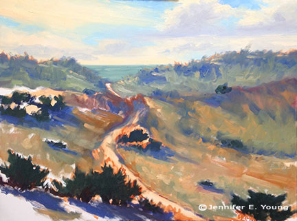
Here are a few progress shots on the Hatteras Island Dunes painting I last blogged about:

Work in progress landscape painting by Jennifer E. Young

Though I am trying hard to address the picture as a whole, it is some kind of work just getting the canvas covered. I have been painting pretty small lately so I am kind of shocked at the amount of paint I'm mixing and using. I think this is especially true because I'm not used to using such an absorbent surface.

In the process of working solely from my painted studies, I've noticed that one of the main reasons I love the smaller alla prima pieces is the amount of broken color in the painting. Color is laid next to color, sometimes within the same stroke, and brush strokes aren't overly licked or blended. The result is that you can achieve a really fresh look with the little ones. It's not impossible to do this with the larger paintings, but you do have to really work wet-into-wet the whole time, and start loading on the paint to get that kind of effect. To have that kind of expectation with a painting of this size may very well be an exercise in futility, especially since I am not able to paint on it every day. On the other hand it is really impossible to replicate stroke-for-stroke what I have done in the smaller studies, as the brush size-to-canvas ratio would mean I'd likely have to turn to using house paint brushes!

So with these "reality checks" in mind, I am still striving to capture that fresh, breezy, beachy essence, even if the nature of this beast is very different from the original. I find myself working more background to foreground on the bigger paintings (rather than strictly dark to light) in order to keep the paint surface workable. Nevertheless, I am saving most of the lightest highlights toward the end because they are the most opaque and have the thickest application.

French landscape painting in progress

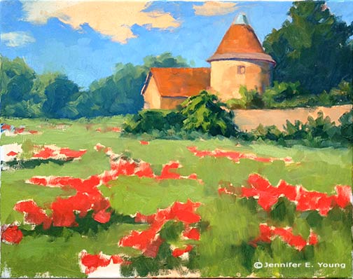
School's out for summer today so over the next couple of weeks we will be in transition mode as we settle into a new summer schedule.  I'm painting this French 16x20" landscape IBKT,  (in-between kid time) and I forgot to photograph this as a step by step.

French landscape with poppies in progress © Jennifer E Young

I started this late yesterday and today I'm trying to address the  whole canvas in a general way first,  so that when I return to the easel I can jump right in to the next level of detail. I really hope I can work on this wet into wet the whole time though, as it's so much easier to manipulate edges when the painting remains open. It needs a lot more work, obviously, but I'm enjoying the simplicity of this composition so far.

Lessons from the workshop

I thought I'd share a few of the studies I worked on during the Matt Smith workshop I posted about earlier this week. I will first preface by saying that my haste in preparing for this class came back to haunt me, so while I was well prepared in terms of my art supplies, I misunderstood what I was supposed to bring in the way of reference materials. The support documentation said to bring plein air studies and/or photos, and for some reason I took that to mean that plein air studies were preferred (maybe I was just hooked on the idea of plein air!) I probably should have asked beforehand about this because I did feel a little puzzled when I was packing about referencing a small scale plein air to make another small scale painting. (I usually translate small plein airs to larger works in the studio, but the recommended canvas sizes were all under 12x16"). In any event, I packed a number of my plein air pieces for reference, and then as a total afterthought printed off a few of my photos "just in case."

After seeing one demo and hearing the discussion though, I realized the error of my ways. I talked to Matt about what I should work from and he said he would rather see what I could do with my photo references for this class. Matt did bring a number of his own photo references for people to use, but I really dislike using other people's references. Even though we are composing with light and form, I want references that reflect my real experience of having seen (and felt) a place.  So I did what I could with what I had, but I really wished I had brought a more extensive selection of my hundreds upon hundreds of photos I have in my personal archive.

This  first painting is also the most incomplete:

In all of my paintings the common feedback from Matt was to take my brush and "knock back" some of my brushwork that competed with my statement or focal area. For instance, in this painting, our conversation went something like this:

MS:  "Is this painting about the light or shadows?" JY: "Well, I like the highlights on the edges of the poplar trees the best". And with that he took my brush and blended back the rather boisterous brushwork that was beginning to take shape in the shadow passages. MS: "You're giving equal weight to both." Next he mixed a bold tree highlight and swept it upwards on the edge of one of my poplar trees calligraphically, making the highlight really jump out. JY: "Ah, I see! But...I wouldn't just leave it like that...would I? It looks pretty unfinished." MS: "No, not necessarily. But you may restate and knock back several times before you get it right."

 I have such a love of brushwork, but it probably can work to my disadvantage sometimes. The hard part, I think, is figuring out what, exactly, is "right", and what is too little or too much. It's all about finding that balance, where active areas are juxtaposed with quiet passages. It's the quiet passages that play a supporting role and allow the more active ones to take center stage. To paraphrase something Matt said in one of his talks, it can't all be "important". Filter the noise and find the important elements.

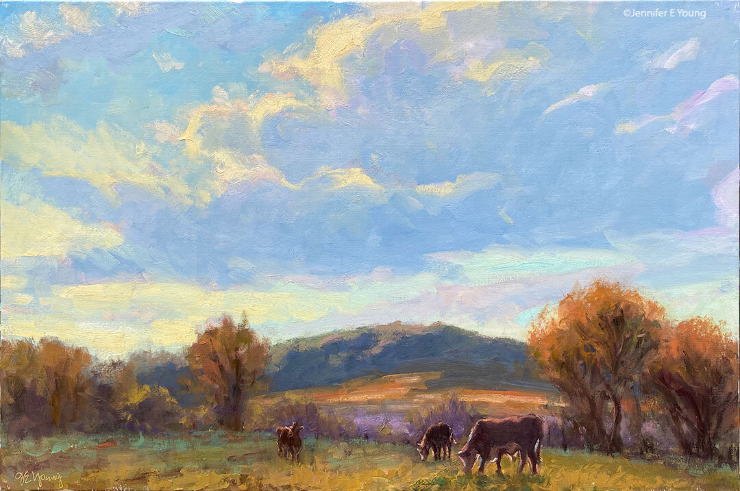
I soon abandoned the first study, deciding to just keep that as an annotated lesson.  The second 8x10" painting below is more complete, and may look familiar to some long time blog readers. That is because I painted this scene before en plein air, and blogged about it here. The photo in the link is too dark overall but even so, I think this second study is much more infused with light. (So this exercise will be very helpful to me when I translate the concept to a larger painting, which I really am excited to do now! ) For the painting below, though,  I thought I'd try it again using just my photo reference and see what kind of feedback I could get, and whether it would look decidedly different as a result.

"Rooted II" (Study) Oil on panel, 8x10" ©Jennifer Young

"Rooted II" (Study) Oil on panel, 8x10" ©Jennifer Young

I really loved the composition as it was, so it remains relatively the same in this second attempt. But in terms of paint application,  I got some helpful hands-on feedback from Matt again. Again he took my brush and knocked back the brushwork of the distant trees to make them sit back more and look less stylized.  Fair enough. He then demonstrated "opening up the shadows, using reflected light cast from nearby objects to cast color into the shadows. He put a touch of blue, for instance, on the shadow side of the tree trunks reflecting the water, and the warmer tones reflecting warmth from the stones or earth. That was awesome. After that he showed me how an assertive hand used to apply just a few intense highlights could suddenly make the painting pop. I reworked some of what he put in but played with those general ideas. But that rim light of his along the trunk and the 3 or 4 dabs of bright green paint on the tree leaves remain just as they were applied. (And don't they just sing?)

I felt I was finally getting somewhere on this final painting (below), though we had some helpful discussion early on about using perspective to direct the viewer to the focal point. He again knocked back the distant mountains with no paint, just several swift blending strokes (sigh.)  I don't consider this painting really finished either but I love the composition and I think I would like to try this again on a larger scale. It's the Dordogne as seen from the top of the Chateau de Beynac.

"Dordogne River" (Study) Oil on canvas, 9x12" ©Jennifer Young

"Dordogne River" (Study) Oil on canvas, 9x12" ©Jennifer Young

I think overall his main critique of my work was that he wanted to see both more paint and a more deliberate, assertive handling of paint. And it's really hard to do the latter without the former. As he put it, you need to have enough paint there so that it expresses the character of the medium. Otherwise you need to ask yourself, "Why are you painting in oils?"

The class was listed as an intermediate-advanced class and I felt the instruction and the students lived up to that. I left the class pretty exhausted but with a lot to think about on my 6 hour drive back home. It will be interesting to see how I can apply Matt's feedback and insights to my work, while still making my paintings "mine". Once or twice the feedback was hard, but I soon realized, as with any class, it's important to leave your ego at the door and come with an open mind if you really want to learn.

Matt Smith workshop

Oh yeah, I have a blog! ;-) Actually, I didn't forget; I've been doing a little traveling up north to the New Hope School of Art to take a workshop from the very talented painter Matt Smith. The trip was noteworthy for a number of reasons. First, it was the first time I have been away from my daughter for more than a night. (That part was hard.) But second, it was also the first time I've had in 4 years to do nothing but paint and immerse myself in "art stuff" for four days straight. (And that part, my friends, was luxurious!) I haven't taken a workshop in a very long time. But now that my daughter is getting a little older, I really feel like it's time to amp up my art life in some significant way and infuse my work with new insights. So when I heard Matt was coming east to teach (he's based out West, so that's something I'd not caught wind of before around here) I knew it would be an excellent opportunity to do just that.

Please excuse the poor photo quality but this was shot with my iPhone in low light. Here you can see the very light way Matt holds his brush to apply paint and manipulate edges.

Matt hails from Arizona, and is best known as a painter of the Sonoran desert near his home, as well as the snow capped Canadian Rockies and other places out west that epitomize the classic western landscape. What initially attracted  me to his work though was not his subject matter, but the sensitivity in the handling of  his brushwork and edges. They are both bold and delicate at the same time.  But after seeing him demo and talk about his approach, I was equally impressed by the purposeful way he composed his paintings and orchestrated his compositions to createpowerful statements. I won't get into a blow by blow description of day 1-4 of class, but I will share some of the significant things I took away from it personally, most likely in more than one post.

The interesting thing about this workshop was that even though Matt is best known among artists as a plein air painter, the class was held entirely inside, in the studio. I'll be perfectly honest here and say that when I signed up for the class I was mildly disappointed that the format would not include at least part plein air painting, especially since Matt himself is a seasoned field painter and the area where the workshop was located was very scenic. (It was the birthplace, in fact, for an entire movement of landscape painters, known as The New Hope School and Pennsylvania Impressionism.) Largely though, that disappointment was entirely personal. My studio is my workhorse, but plein air painting is more exciting to me. Also with my life situation at present, I just don't get the longer stretches of time needed to trek out in the field as often to paint.

When I asked about the reason for the indoor class, Matt's response was that in his years of teaching, he has seen the same problems pop up again and again, whether in the field or in the studio. Maybe he felt it's better to address these fundamental issues in a controlled environment rather than adding another layer of difficulty with the environmental factors that plein air adds. In any event, the format turned out to be fine. In fact, there was plenty I needed to work on just with my studio work,  the studio environment definitely allowed Matt to get to each student several times a day with valuable feedback. As it turned out, the weather was not great any way, and we probably would have needed to seek shelter for at least two of the four days due to rain and wind.

Matt did several very good demos (using his photo references). He used a Strada easel, which I think was a rather new purchase for him. He talked a lot about equipment and painting gear, which, as any regular reader of my blog may have surmised, is a topic of great interest to me. The Strada is made of metal and looked like a neat little box (I think his was the mini, which is presently sold out.)

The Strada Mini Easel

But even without the two winged accessory attachments added to provide more workspace, it was a very heavy box for its size. Matt said he liked it because of its compact size (it easily fits into a backpack) and durability for travel, but personally I could not deal with the heft. A Gitzo travel tripod was also part of his setup, which looked great for its ease of use and small size when folded (also easily fitting into a backpack), but a quick Google search soon told me this item was way out of my price range. (Wowsa!)

Matt, by self-definition is not a colorist. In fact, of the fundamentals he sites as essential to a good painting (Drawing, Value, Design, and Color) the most expendable he says, is color. Even so,  I found his palette fairly wide, with four blues, two earths, two yellows, an orange, one red, a violet, and a couple of greens (plus, of course, white.) He used no medium other than his oil paint and a very tiny amount of Gamsol to thin his paints.

His start consists of a very light sketch, soon followed by masses of color, working broadly to get his main elements and shadows down. He then builds from there, thin to thick, dark to light, broad to more detailed. One thing I found interesting is that he almost always left his sky a white canvas until close to the very end of the process. Obviously this is working to his great advantage, but try as I might, I couldn't resist my normal method of putting the sky in early on. This was especially the case if there was any water in the landscape, as I find  I need that sky information to know what's being reflected.

I've a lot more to say on the subject but I should probably try and paint something now! In my next post I'll share of few of my studies done in the workshop, as well as some valuable take-aways that I received from Matt's feedback.

A good value

If you have been reading my blog long enough, you may find that I obsess a little over art supplies and gear. A few months back a fellow artist mentioned that a great tool for judging values was a Kodak Wratten 90 filter. So for a few months I was on a mission to find one that was A) big enough to comfortably look through (ideally 4x4) and B) low enough in price so as not to break the bank. After searching online and watching the bidding wars on eBay, I found the combination of the two criteria impossible to meet. Then one day it dawned on me that I used to have a little red value viewer tool that I'd picked up in a sewing store. I don't know what happened to it, but I thought I'd poke around on Amazon to see if I could fine something similar. Lo and behold, I stumbled upon this little number:

Like the Wratten filter, this value finder helps neutralize color so that you can more accurately discern the values in your reference. Not only that but it has 3 view finders of different aspect ratios that will work with a range of canvas sizes. It also has optional guidelines that you can overlay to check composition, AND a couple of value scales to check your paint mixtures.

The drawback is that the filters are red rather than the nice grayish neutral of the Wratten filters. This may not appeal to everyone. But with a $14.95 price tag it is a good option and specifically geared toward the painter. I have been using it with studio work and it does a good job at neutralizing color so that I can judge values with more accuracy.  I haven't used it outdoors yet but I think there it would be even more useful when making on the spot judgements, and I look forward to taking it along with me (hopefully this week) now that the weather is warming.