Illuminated

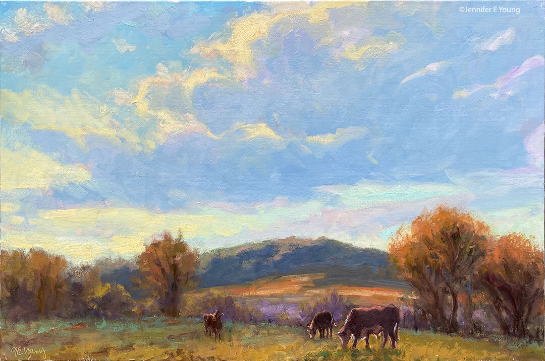
This was a bit of an experiment for me. I pushed the color and moved things about quite a bit, and worked in a much more impressionistic style. I played with layering color and working more with broken color to achieve the shimmering effect I was after. It's definitely more about expression than about straight on  realism.

"Illuminated" Oil on Linen, 24x30"  Jennifer Young

"Illuminated" Oil on Linen, 24x30"  Jennifer Young

This was in part because my photo reference was very washed out, yet I remember this time and place so much more vividly and with much more richness in color and brilliance.  I had painted a small study on site during a summer trip to Nelson County, Virginia, but couldn't finish it because the light of the setting sun changed so fast and quickly disappeared behind the trees and mountains.

I'm not sure if I will continue in this vein, but I feel as if I have learned something. Here it is in grayscale, which I actually might like a little better (LOL.)

It makes me want to experiment with it again, with a different color palette, to see what happens.

Varenna mini gouache study

Thought I'd do a little experimenting with this fun little 5x6" study in gouache.

"Colors of Varenna (study) Gouache on Cottonwood Arts Coldpress paper, 5x6" ©Jennifer Young

"Colors of Varenna (study) Gouache on Cottonwood Arts Coldpress paper, 5x6" ©Jennifer Young

Here I'm just trying to get an idea about my lights and shadows and the basic shapes, so I've not much detail. For this composition I experimented with using a compositional grid that we studied during Kevin Macpherson's workshop (you can probably make out some of it in pencil beneath the gouache. I mentioned it briefly in my last post, but basically this is a method to achieve an informal subdivision of space, as discussed in Andrew Loomis' book called Creative Illustration:

loomisgoldensection
loomisgoldensection

After I learned more about this "grid thing", I realized that I had often been using this kind of subdivision intuitively. But it is good to have a tool handy to be more deliberate about it when one wants to, or if you are dealing with a complicated subject and are trying to decide what to leave in, what to edit out, and how to arrange a painting for the most pleasing effects.

It's been a while since I have worked with gouache and had forgotten that the colors shift a bit when they dry. Nevertheless I had a good time and really look forward to working with them again.

Week-long study with Kevin Macpherson

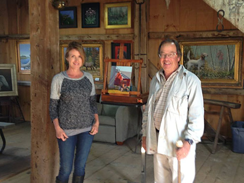
Jennifer with Kevin Macpherson

Jennifer with Kevin Macpherson

Last week I did something I haven't done in a very long time...devote myself to the art mistress from morning to night for an entire week. And it was a week studying with the talented Kevin Macpherson at that! As you may have read from my previous blog posts,  I am a big fan of his paintings and his books. He is truly one of the best teachers I have encountered so far. Not only is he a highly skilled painter, but he has a way of honing in on and distilling essential information that actually penetrates my rock-hard noggin.

The workshop took place in a beautiful new space called Chesapeake Fine Art Studio, run by artist Hai-Ou Hou in Stevensville, MD (great location- about 20 mins. away from Annapolis). If you are an artist on the east coast,  it would behoove you to check out her site. Hai-Ou is quite the painter herself, and also appears to be drawing some of the best and brightest painter/instructors in the plein air and traditional/representational painting movements.

I really wish I had time to delve into all I learned during my workshop experience, but life is slamming me pretty hard right now. This week marked a return to the "real world" (insert the sound of needle scraping across a record here) with kitchen renovation, school activities, and doctor's appointments commanding most of my time and energy.

But my biggest takeaways from Kevin's instruction had to do with value and composition. He spoke a lot about light and shadow, and how one can create much stronger paintings by clearly indicating which elements belong in the light family and which belong in the shadow family. (This sounds simple in theory but it isn't always so easy in practice.) He stressed seeing and painting "shapes, not things", with the idea that if we are too wrapped up in painting a "thing" we lose the ability to really see it accurately and how it relates to the rest of the painting as a whole. We spent a good deal of time really learning how to see the true value of things (er, shapes, that is!) He stressed using a color isolator in the field to identify true value and color, determining and laying down your darkest note of color first, followed by the rest of the shadow family, and finally the values in the light family, keying everything up from that very darkest note, so that you really can get a handle on color and value relationships.

In essence, how dark you key your darks will determine how light you key your lights. I use the analogy of playing "Chopsticks" on the piano. You can play low on the scale or high on the scale, but the arrangement of notes and their relationship to each other are the same no matter how high or low you move along the keyboard.

Kevin Macpherson's workshop

His demos didn't disappoint. In addition to demos in the field, mid-week during his opening he did a remarkable demonstration in the studio (from a photo) on a canvas sized at about 20x24" . During that opening he also presented an inspiring and highly entertaining lecture. This lecture, I understand, was very similar to the one he presented at the Plein Air Convention. Not being able to travel as much as I used to, I really appreciated having the opportunity to see this presentation, in a much more intimate setting.

Though we were meant to work largely out of doors, we had our share of rain and wind. When the weather didn't cooperate, it gave us the opportunity to study (in the gorgeous and spacious studio) some of the more pertinent points Kevin was trying to drive home. We spent a good deal of time studying value relationships among the "light family and shadow family". On another occasion we delved into "The Golden Mean" or "Golden Section" (the informal subdivision of space) and he presented a fascinating slide lecture with many, many inspiring examples of  how it has been used by painters throughout history.

Kevin Macpherson's painting demo

Here are a couple of my plein air paintings done during the workshop that actually reached a level of finish:

"Silo Shadows" Oil on panel, 10x8" ©Jennifer Young

"Silo Shadows" Oil on panel, 10x8" ©Jennifer Young

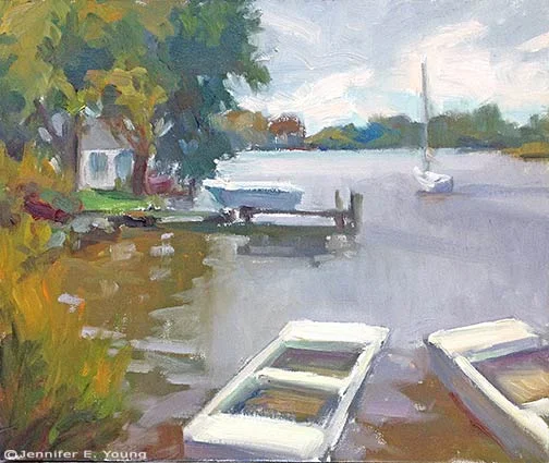
"Docked on a Gray Day", Oil on canvas, 10x12" © Jennifer E. Young

"Docked on a Gray Day", Oil on canvas, 10x12" © Jennifer E. Young

At the week's end, I left feeling completely exhausted and totally exhilarated at the same time. I didn't leave with many "finished" pieces, but that wasn't my goal at all any how. What I did leave with was a wealth of knowledge and insight, as well as a good deal of creative spark. Whether that spark ignites a fire, is now totally up to me.

Sand Play

If you live in Richmond. Virginia and heard someone crying out in agonizing frustration this afternoon, it may have been me trying to bring this painting to a satisfactory conclusion.

"Sand Play" (NFS) Oil on Canvas, 12x12"© Jennifer E Young

"Sand Play" (NFS) Oil on Canvas, 12x12"© Jennifer E Young


This was actually an experiment, and one of those "what would happen if..." paintings that I probably would have put unfinished in the "circular file". But my four year old daughter (who is the subject of this piece) saw it in progress.

"When I grow up to be a beautiful woman," she said, "I will give this painting to my little girl". (How cute is that?) Of course, after that, I had to finish it. I may add a little touch or two, but it is more or less done. When my daughter saw the final, she squealed with delight and said, "Thank you Mommy!" That made it all totally worth it! (And now the neighborhood can enjoy their Labor Day weekend in peace.)

Progress on the large Hatteras painting

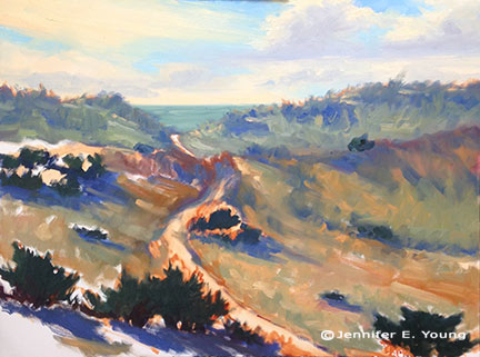
Here are a few progress shots on the Hatteras Island Dunes painting I last blogged about:

Work in progress landscape painting by Jennifer E. Young

Though I am trying hard to address the picture as a whole, it is some kind of work just getting the canvas covered. I have been painting pretty small lately so I am kind of shocked at the amount of paint I'm mixing and using. I think this is especially true because I'm not used to using such an absorbent surface.

In the process of working solely from my painted studies, I've noticed that one of the main reasons I love the smaller alla prima pieces is the amount of broken color in the painting. Color is laid next to color, sometimes within the same stroke, and brush strokes aren't overly licked or blended. The result is that you can achieve a really fresh look with the little ones. It's not impossible to do this with the larger paintings, but you do have to really work wet-into-wet the whole time, and start loading on the paint to get that kind of effect. To have that kind of expectation with a painting of this size may very well be an exercise in futility, especially since I am not able to paint on it every day. On the other hand it is really impossible to replicate stroke-for-stroke what I have done in the smaller studies, as the brush size-to-canvas ratio would mean I'd likely have to turn to using house paint brushes!

So with these "reality checks" in mind, I am still striving to capture that fresh, breezy, beachy essence, even if the nature of this beast is very different from the original. I find myself working more background to foreground on the bigger paintings (rather than strictly dark to light) in order to keep the paint surface workable. Nevertheless, I am saving most of the lightest highlights toward the end because they are the most opaque and have the thickest application.