Provence lavender lay-in (W.I.P.)

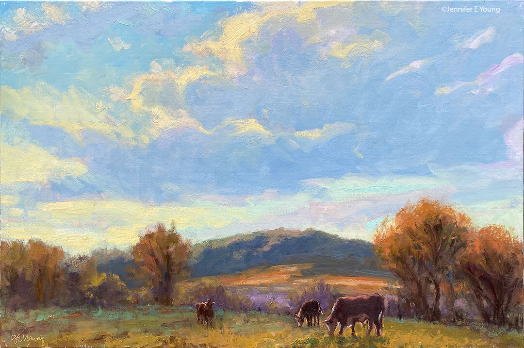
This has been my first real opportunity to paint in over a week. It has been really hot, muggy weather lately, so I've decided to stay close to the studio and scour some of my old photo archives for landscape subject matter. In doing so, I came upon some of my images of an area of Provence that I visited in lavender season almost 10 years ago (!) called La Drome Provencal. Here's a 16x20" composition I've mapped out:

Provence lavender landscape painting by Jennifer Young

I have more to flesh out in terms of both shadow/highlight and detail, but I've started with a basic block-in to nail down my composition. Up to now, I've used the same color palette as the previous painting I posted of Lake Como. But when I started to lay in the lavender I had the overwhelming temptation to reach for a cooler, more transparent red (like alizarin crimson) to add some brilliance. I have held off up to now.

What I aim to see is if I can achieve the proper color relationships in the painting without having to resort to any other colors than the three primaries I've chosen. Alizarin Crimson (permanent) has long been my default red when I paint in a single primary palette. While it is a beautiful transparent color, I sometimes feel it is almost too garish in my mixtures.

So I feel it is worthwhile to try and achieve a luminous, vibrant quality to my paintings without having to resort to over-the-top color. Being somewhat of a color slut, this is not an easy challenge for me! We'll see if I can hold out to the bitter (better?) end!

Oil paints bursting in flight?

Here is a recent question from a reader that I thought I'd share at blog central:

I am planning to bringing 100s of oil paint tubes back from Beijing and I am wondering if they are at a high risk of bursting? Your advice would be highly appreciated. Best, J.


...and my response:

Dear J- If these are tubes of artist's oil paints, my experience has been that there wouldn't be much danger of that. After all, they are regularly shipped all over the world. And while some paints do contain driers and additives that are considered combustible, most are made with just pigment and a nut oil or linseed oil.

But don't take my word as law. Most of the well known brands will provide material safety data sheets (MSDS) for their art materials, which should provide a flash point of the paint in question (combustibility at a given temperature). You could always check the information provided on the MSDS with the airlines to see what their restrictions are. Most likely you will need to check the paints if you are flying commercially. Otherwise they could get confiscated if you try to bring them in your carry-on (but you probably are already aware of that!)

Good luck! (And check out a prior, more detailed post of mine on flying with oil paints from more info.)

Of Paint and Palette Knives

Here is a recent message I received from a reader that I thought I other blog readers might find of interest: Q: Can you tell me if you use painting knives or if it is all done with brushes? And do you have a favorite brand of paint? -N.M

A: Hi N.M-I paint primarily with a brush, but here and there I have been using the palette knife as a painting tool (rather than just a tool for mixing). If you can get your hands on Richard Schmid's video on painting the landscape (June in particular), he has an excellent demonstration of how he uses the palette knife in his paintings. I am experimenting with his technique (as I understand it) but, not for every painting. So I wouldn't call myself a palette knife painter by any means.

As for paint brands, I'm looking at my paint bins now, and I see Winsor Newton, Gamblin, Holbein, Daniel Smith, M. Graham, Rembrandt, and Old Holland! I probably use Winsor Newton and Gamblin most often, but I have had good experiences with all of the above. I often base my decision on which brand to buy by the pigment I am after. Some pigments seem to be pretty particular to one brand. But even paints that go by the same name can vary quite a lot in hue, value, or color temperature. For instance, Winsor & Newton's Cadmium Yellow Light is warmer and I believe, a bit darker than Gamblin's, which is more lemony. That's not necessarily better or worse-- it all depends on what you're after.In any case, I make sure that I buy professional grade paints, rather than student grade. They are more expensive, but there is a big difference in quality.

I hope this helps, and happy painting!

A neat little tool

I haven't yet had time to edit my new pictures for the vineyard work-in-progress I have been posting about recently. So instead I thought I'd share a neat tool I found online for all of you meticulous types. It is an online proportional scale calculator. This is often the tool of printers who need to know what size a final print would be if an artwork is reproduced to a different size. But I find it a handy tool for anyone who wants to translate a small sketch or plein air painting, (or photo)  into a larger painting. Here are two variations of the calculator, so take your pick. The first is actually from the printer Century Editions' site. The second is by scriptygoddess.com. They can help to take some of the guesswork out of what size canvas you might use that is of the same scale as the smaller work. I am not one to grid out my landscape paintings in any meticulous way, but I do find a proportional calculator helpful in judging placement (usually via the eyeball method). You can also get a proportional scale wheel at an art supply store, but seeing as I have misplaced several of these over the years, it helps to have an online option!

Painting on a colored ground

Every so often I'll get a question about my painting process that I think might be an interesting topic to share here on my blog. Recently an artist friend asked me about the red ground I prepped my canvases with at one time.  I'm sure I've addressed toning a canvas a few times here on the blog, but since I've been asked about painting on a red canvas a number of times, I thought it would be a good idea to address this question specifically. Here is his question, followed by my response: Question: Are you still using red underpainting most of the time? Is that landscape specific or do you switch up for sky/water? 

My response: As for the red ground, I never use it any more. I really only used it for landscapes. It was fun because the underpainting gave vibratory effect due to it being a complement to the greens.  But it was too much of a distraction for sky and water, and ultimately I personally found it so for all of my landscapes, especially as I moved a little closer to realism.  Plus I got too lazy to tone my canvases that color as I'd have to let it dry first. Otherwise the red would lift and get mixed into my painting too much. Now in the studio I either just paint on a white canvas, or tone it with just a quick wash of transparent red  oxide (a.k.a PR101- the color I used in the tonal underpainting here).  That still adds a warm tone but is muted enough that it doesn't distract. It also isn't as high staining so I can apply a wash and then start painting immediately after.

*This artist is a studio painter, but I'll add here for the benefit of my blog readers that if I'm painting outdoors, I pretty much always use a mid-toned canvas of either gray, or a wash of trans red oxide or raw sienna, as sun on the white canvas creates too muchbounce and glare.