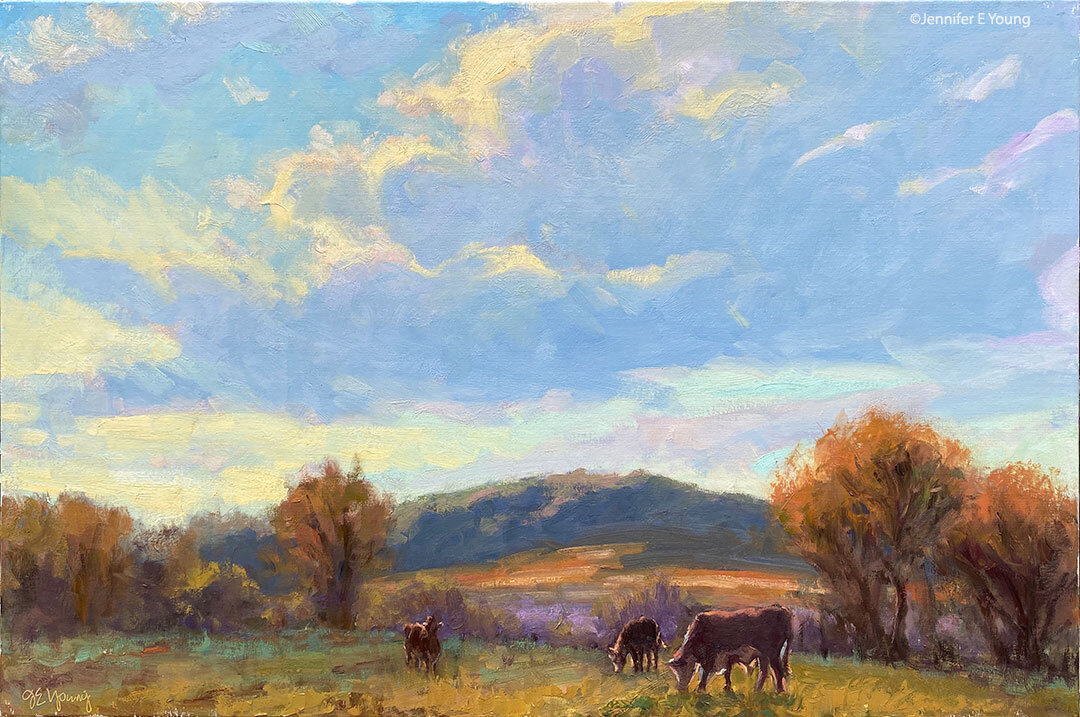
French pastoral WIP and art studio WIP, cont'd

The misty painting of the Lot Valley continues....

Lot valley france landscape painting

Still trying to keep things soft, but articulate them at the same time. Today I'm working on the sheep. Meanwhile, I've been told that it's okay to continue my obsessive postings about the new studio ;-) . So here's a little mini tour:

First of all, so much of the furniture in this space came from IKEA that you'd think I had an interest in the company or something (none exists--other than a serious interest in shopping there. ) In fact, we put so many of my "IKEA finds" together that Dave started calling it "I killya" because of how much this stuff weighs. Still, there's no denying that they have some intelligent designs to outfit an office and art studio (and the price is right too!)

Here's a view of my painting area and the sink. At first I was going to go with a regular utility sink and cabinet, until I found the "Udden" sink at IKEA.

artist's studio jennifer young

That sink nearly DID kill us, actually--trying to lift the coordinating cabinet up to screw it into position in it's nifty little slot. For a while after that little ordeal I seriously thought I had nerve damage in my hand (my "painting hand, too!)

Below is a view from my little sitting/library area looking toward the art bins that Dave built for me. There are some more bins on top temporarily, but they will go up in the loft area when we're finished with them. At this writing, we're still working on studio storage, so I'll write more on that in a future post. A bookcase blocks the view, but the sink sits across from the bins, and my main easel stands across from the full-length mirror pictured, so I can check my work in reverese.

artist's studio jennifer young

And now flipping my position, here is a view of my sitting/reading area from beside my art bins (still populating the shelves with my many art books!)

artist's studio jennifer young

I have divided my sitting and office area from the painting/sink area with a large 6 foot room divider with storage cubbies from IKEA's Expedit storage series. I like that it divides the space while still giving me a feeling of openness. What is hard to see is that I've bolted this unit at a right angle to a white bookcase that faces the French doors for added function and stability.

The ladder is actually an old telephone ladder like this one that I bought cheap on Craigslist. We're still working to make it a moving ladder on a track...almost there.

Now we're on the other side of the room divider looking at my table where I do my framing, plein air panel prep, and flat art-mounting. All those little drawers are great for my framing tools and fasteners.

artist's studio jennifer young

In this same "room" sits my office. Can you tell how much I like paperwork? I've rather been avoiding going through my files, but since it's tax season, it's the task before me:

art studio jennifer young

Note those big squares of light from the windows and how far they come into the room. This is why I opted not to have east-facing windows also on my painting side. I will likely put up some kind of sheer window treatment soon to diffuse this light so it won't be so harsh.

Conspicuously absent from these pictures are my paintings that will in future be on the walls and in the bins. We have yet to get them out of my temporary storage space until we have finalized our art storage solutions....but more on that in a future post.

Studio building project- the final stretch

My online presence has been a little quiet lately because we are getting down to the "finishing touches" of prepping my new art studio for move-in. After my lights were installed, I finally came to a decision about the color of the walls, and I've spent the majority of my time in the last couple of weeks painting the walls and trim, installing picture moulding, painting more trim, and touching up walls and trim some more.  (Just one more door to go!) Not only am I body-weary, but I am also decision-making weary. So it is a good thing that most of the big decisions are now behind us. I really had a time trying to decide on wall color. I knew I wanted a color (as opposed to white/off-white). But having had yellow walls in my last studio, (great color for the gallery walls, not great for art-making) I also knew I wanted something that was neutral enough so as not to cast the wall color onto my paintings and palette.

While the color that's so popular right now with many portrait painters (mentioned in this previous blog post) was waaay too dark for my taste, I did like the idea of a neutral gray/green. So I decided to start my quest by playing with a sample of the portrait painters' color (Benjamin Moore's "Mohegan Sage", #2138-30) to see if I could figure out the underlying base color by tinting it with a bit of white.

It may look a little more "colorful" on the computer monitor, but the lightest tint was a fairly dead-looking gray. Benjamin Moore lists Mohegan Sage as a "black", and having tinted it I can see why. It probably is a combination of black with just a touch of yellow. It's very rich in its full strength, but none too inspiring in my tinting experiment! Still, tinting up to an almost elephant gray, I couldn't deny that it is a very neutral color, and thought I could use my tinted sample against some other color swatches to find a related color that was both lighter and more inspiring but still neutral for my studio walls.

What I found was a beautiful rich color that seemed to be in line with the darker sage, though perhaps a tiny bit cooler. It's a color called "Storm Cloud Gray" (also by Benjamin Moore, # 2140-40.)

art studio building wall color

While this color is a good deal lighter than the dark sage, I was still a little concerned that it would be too dark. So I decided to use it on just one wall as an accent and do the rest of the walls in an even lighter shade that I also liked-- again a gray green called "Paris Rain," (BM color #1501). Here is the result:

art studio wall color Jennifer Young

Here are the lighter walls running into the deeper accent wall, complete with sleepy husband reporting for cleanup duty last Saturday morning (what a guy!)

art studio wall color Jennifer YOung

I find both of these colors really lovely and pleasing. Sometimes they look more gray, sometimes more green; though in either instance they still remain neutral enough not to overpower.

In the above picture you can also see the picture moulding we installed so that I can hang artwork. Unlike the trim moulding, I decided to paint the picture rail the same color as the walls, both because I wanted to keep the high walls looking "high" and because the picture moulding was fairly plain and nothing special.

Since Dave (and friends) installed both the floors and the trim moulding, I wanted to do all of the painting myself to give the poor man a break. I totally underestimated how much time it would take. I guess it was those high walls that fooled me, but at last it's more or less done and we've had the "SmartBox" delivered (portable storage box). Over the next few we can actually start the process of moving in, assembling furniture, and piecing together my various work stations. This too will take a while (and likely a few more trips to IKEA) but it's actually starting to feel like a real art studio now. I'm excited about the prospect of being in there and getting back to painting again (as in ART) on a regular basis!

The next big challenge will be figuring out some storage solutions that make sense for the new space. Much of that will have to be dealt with after I've gotten my main workstations set up, but I will be sure to blog about it as I go along. Meanwhile, I doubt I'll do much blogging over the next few days, as we will be moving and dismantling my office for a bit.

Still in the dark about art studio lighting

Now that we have the drywall up in the studio building project, I'm anxious to pick out a paint color and get going on the walls. But since the appearance of the paint color is so dependant on the quality of light you have in your space, I've decided I'll need to tackle the lighting requirements first. I have spent waaay too much time reading about "full spectrum" lighting, color rendering index (CRI), foot candles, lumens, and Kelvin temperature, and I can't say that I'm that much clearer on any of it! I knew going into this project that I would not have the benefit of the full natural northern light that is said to be ideal for an artist's studio. But that's okay. I'm kind of used to working with different lighting conditions, and in any event no amount of northern exposure is going to help any artist on drab or stormy days or after sundown. But what I want for the new studio is as much diffused natural light as possible, and supplemental artificial light that comes as close as possible to the color and quality of daylight.

From my reading I have learned that the balanced color of natural daylight has a Kelvin temperature somewhere in the range of 5000K to 5900K. Kelvin temperatures numerically lower than 5000K turn towards the yellow and then red ends of the color spectrum, and higher numbers tend towards the white and then blue ends of the spectrum. As a point of reference, standard fluorescent lighting is fairly warm and yellow at 3500K, and standard halogen tending more toward the red at 3200K.

Keeping these things in mind, my aim is to light my studio (and especially my painting area) with a light that is as pure, balanced, and near to a clean white as possible in order to better see and mix accurate colors in the studio. (Paintings are always going to look a bit different under different lighting conditions, but I hope to avoid a massive color shift once my paintings leave the studio). I'd also like light that is non-directional so as not to cause a spotlighting effect or glare on the reflective surfaces of my oil paintings.

I have looked at a ton of options online (to the point of brain overload!) so I thought I'd share the leading options I'm considering below. Each have their pros and cons, so the answer will likely be to choose a combination solution that gives me enough light without breaking the bank!

Option 1: Install one or more Solatubes.

Pros:

  • Bright, evenly diffused and true natural daylight when it's at its best.
  • Less expensive than skylights without the spotlighting and worry about "hot spots" sometimes associated with them.
  • Uses solar energy, so there's a potential for lower overall electricity requirements.

Cons:

  • Costly to install, so even though they require no electrical power, it would likely take many years to recoup costs with energy savings.
  • Just as with studios that have northern lit windows, an alternative light source is required for nighttime work, and even likely on cloudy days.

Option 2: Installing high bay, high output compact fluorescent fixtures. (Note: High bay fixtures are optimal in my case due to the cathedral ceiling height of my studio.)

Pros:

  • Offered by many manufacturers in a variety of styles and color temperatures, including "daylight" bulbs. (A few resources are listed here.)
  • Availability is catching up to  tungsten and halogen bulbs, and daylight versions are even being offered in the big box stores like Home Depot.
  • Bulbs last much longer than incandescents, sometimes lasting for years.
  • Much more energy efficient than incandescents and most halogens (fewer bulbs/energy required to achieve the same amount of lighting).

Cons:

  • Difficult to dispose of. While there are more and more recycling options being made available, these bulbs create a pollutant due to the toxic mercury within. It can also be dangerous if care isn't taken to handle the bulbs properly in the event of breakage. (The up side of this is that assuming the bulb realizes a natural life cycle, you won't go through as many bulbs as you might do with incandescents due to the extended bulb life of compact fluorescents.)
  • I am not convinced that the fluorescent "daylight" bulbs can achieve the effects of full spectrum light, no matter what the packages say, though these newer bulbs certainly are an improvement with a much better CRI than the old "office" type fluorescents of the past.
  • Cost: While the fixtures can be relatively inexpensive in comparison to Solatubes and some track lighting, if high bay fixtures are needed the cost quickly edges upwards. Bulbs touted as "full spectrum" are also on average typically priced much higher than incandescents, ranging from $8 to $15 a piece.

Option 3: Solux bulbs used in track or other fixtures.

Pros:

  • Chosen by a growing list of galleries, museums (including the Van Gogh Museum in Amsterdam and the Musee d'Orsay in Paris) as well as artists for the clean natural quality of the lights.
  • Versatile. Bulbs offered in a number of different Kelvin temperatures  and can be used in low voltage track lighting to illuminate artwork or work area, or in task lamps that can be moved to different locations.
  • Small bulbs are a lot easier to store than 4' long fluorescents!
  • Long-lasting

Cons:

  • These are essentially "directional" lights, with limited spread. While they appear excellent for lighting artwork and even small focused tasks such as reading, they are not going to light up a room or achieve a diffused ambient light. And I'd likely have to focus a number of these lights on my painting area to blend the beams for a large enough  spread.
  • More potential for glare on my canvases, due to the directional focus,  though I could purchase the optional diffusers which may help with this somewhat.
  • Cost. These bulbs are relatively inexpensive if used selectively, but could be prohibitive if used widely, as bulbs range in price from around $8-up, and the fixtures are not cheap. Task lighting fixtures are also rather expensive.
  • Halogens generate a lot more heat and use more energy than compact fluorescents to achieve similar lighting levels.
  • I have heard reports that colors shift over time towards the warmer end of the spectrum as the bulb ages (but this is true of most halogens and fluorescents too.)

So there you have it. Okay so I may be overthinking this, but since lots of quality light was on the top of my "ideal studio" list from the get-go, it's pretty important to me. But even after all of the research, I'm not sure if I've really shed much decisive light on the subject! Ideally I'm leaning towards a combination of Options 1 and 2, with #3 reserved for the occaisional supplemental light, if I happen to install tracks down the road.  But let's face it, I also have the very real consideration of a budget to deal with as well, so I'll have too see how well reality meets up with the ideal. I would really welcome any additional suggestions, thoughts, ideas or experiences on this topic, so please feel free to leave your comments on the blog.

P.S. This is part of a series of posts I have explored while building my new art studio. For my additional in-depth analysis on studio lighting for artists, go here and here.

Photographing oil paintings for the web

Thanks to my niece Molly, a talented artist in her own right, for inspiring this blog post: So you have a nice little painting you've just completed, but none the photographs you took do it justice. How can you get decent photos for your website? I am certainly no expert photographer, but I will share what I do for my own website to produce decent reproductions of flat art for online display.

Photographing artwork is definitely a little tricky. If the artwork has any sheen at all, any flash or angled light can cause glare on the surface, which will distract or obscure the true nature of the picture. These days, I use a digital camera for all of my photography and tend to do a fair amount of color correction in Photoshop.  But I used the same method of photography I will describe below, even in the pre-digital age when I made slides of my work. 

The best conditions I've found for photographing artwork is outside on a bright but cloudy day. This gives consistent diffused light and the least amount of glare. If photographing on a sunny day, try to set your painting up at the edge of a shaded area so that enough light reaches the painting without shining directly on it. Tree shade isn't good because of the dappling. It needs to be even light, so maybe an overhang on the side of a building or something.

If you are shooting film or are otherwise not able to correct the camera angle after the fact, you'll need to make sure your canvas is as perpendicular to the camera as possible. You can either set it up on an easel or hang it on a wall on the side of a building if the overhang isn't too large. To avoid the fish-eye effect that can occur because of a wide-angle lens curve, you should set your camera up on a tripod far enough away from the painting and zoom all the way in on your painting to fill the lens as best you can with the picture. This will minimize that fish-eye distortion. (Thanks to artists David Darrow, James Abbott and others in the Daily Painters Discussion group for this and other technical tips!) 

When photographing, I use my camera's manual setting so that I can set the white balance and bracket the exposures, just in case what I'm seeing in the viewfinder isn't what I get on my computer screen. Then I'll examine all of these images in Photoshop, and with the painting sitting next to me, I'll make adjustments to the chosen image in brightness, contrast, color, etc. Photoshop is great also for correcting the picture if the painting doesn't look exactly square. But Photoshop is also $$$ so if you don't already have it, you might look for a cheaper image editing software program that can do most of these basic corrections.

For the web, I will overlay my copyright info and save my images as 72 dpi JPEGs. For archiving, though, I save the image at the largest size my camera setting will allow, and save it as a TIFF. JPEGs are fine for web stuff, but not great for archiving because it is a "lossy" image format. This means that every time the JPEG is opened it looses a bit of information, even if it is a large file. For any kind of high quality reproduction (such as giclee prints), the best option is to have the painting professionally scanned or photographed at a very high resolution.

Vibrant new show for the First Fridays Art Walk tonight

It's raining now, but they're predicting a clearing by 5PM, so head out to the First Fridays art walk downtown tonight. We're open early from 6 to 8:30, and there's ususally plenty of parking on Main Street. Opening tonight at the gallery: "A Touch of Red"- New and recent landscape paintings from Provence to the Tropics with a splash of Valentine's Day red.

"A Place in the Sun", Key West Oil on Canvas, 16x20" ©Jennifer Young

"A Place in the Sun", Key West Oil on Canvas, 16x20" ©Jennifer Young

Where we are: 

Jennifer Young Studio & Gallery is located at 16 East Main Street, (between 1st and Foushee) two blocks east of the Jefferson Hotel.

New winter/spring hours: 

Beginning in February, gallery hours for the winter/spring season are Wednesday through Friday from 12-6 PM and Saturdays from 11-2.

We're also open during the First Fridays Richmond Art Walk from 6 to 8:30 PM and by appointment at other times. For additional information contact us or call 804-254-1008. Click here to view a map and get driving directions from your location.