Cezanne exhibit at the National Gallery, D.C.

Many have likely already known about the fabulous exhibit running through May 7th featuring the masterful paintings of Paul Cezanne. The show is entitled "Cezanne in Provence", and will focus on his paintings reflecting the love of the landscape surrounding his birthplace. I've known about this show for a while but exhibits like this never seem to emerge to the surface of my awareness until they are almost over.

I saw a fabulous Cezanne exhibition at the Philadelphia Museum of Art some years back, and while it did have a number of landscapes, there were a lot of still life and figurative paintings in that show. I am very excited about this most recent exhibit because the focus seems to be on the landscape and local people surrounding the village of Aix. I did not get into Aix on my visits to Provence (though I do hope to do so at some point!) but I have been all around that gorgeous countryside and can certainly understand why Cezanne was so passionate about it.

I missed out on a terrific Alice Neel (one of my favorite modern figurative painters) show up in D.C. recently, so I am extra-determined not to miss the Cezanne show and miss out on another opportunity.

Tags:

Planning a painting

One might assume that if an artist already has a photo of the scene, no further planning is needed. However, I always find it helpful to plan out my composition a little bit in advance before I dive right into painting. This saves consistent editing to the composition on my canvas, though editing and refining are still a part of the painting process. A sketch need not be overly detailed, but it is still helpful in order to figure out the placement of things. Where is my horizon line? Where is my center of interest? Where is the sun in relation to my subject, and where will the shadows fall? What from the scene do I feel is important, and what may I want to edit out completely?

A sketch is also helpful because my canvas proportions may be different from the proportions in my photo. Therefore, I have to think about how to crop a scene to make it most interesting. Here is a photo of a scene in the Luberon valley of Provence that I took when I was there painting on location. A lovely little church served as a backdrop for a beautiful cherry orchard strewn with pink and white wildflowers. The photo does not do justice to the gorgeous wildflowers that were in this scene, but since I was there and painted and sketched in this area, memory can serve me well here:

Here is my very quick sketch. I plan to eliminate one of the middle ground trees, and use the two foreground trees to frame the scene. I establish where my horizon line will fall. At this point I am thinking it will be more interesting to have the horizon line a little higher up in my scene, rather than right smack in the middle of my canvas. Having my center of interest (the church) just off to the left of center creates a more dynamic composition as well. I also establish my light source and determine shadows.

Here is the painting, pretty well laid out. It is 12x16". It's been snowing here so the lighting coming in my studio windows has not been great for photography and this photograph has dulled my colors somewhat. I'm still working out the distant trees and the grasses and wildflowers in the foreground. I will post the completed painting on my website in the Provence Paintings section when it is complete.

Back from the Workshop

The Friday workshop was a lot of fun. I was impressed by the talent and friendliness of the entire group, and it sure made my experience a real joy. I look forward to giving more workshops in the future! I will post more pictures of the class on in my "photo journal" on my website when I have time, but here are a few images in the meantime. The class began with a little talk and a demonstration. Here is a shot of the classroom. I'm standing in the front of the room (wearing a black shirt and green apron).

Giving the demo... 

An action shot of the painting process; I'm laying in my lightest and darkest areas first to establish my values. 

I got about half way done with this little painting before the participants broke out and started working on their own projects. I should have the finished painting up on my website soon.

Read about Jennifer's current and upcoming workshops here!

Fun with Gouache

I spent some time yesterday playing with gouache paints so that I could see how I liked working with them as a possible candidate for my portable studio. Gouache is a water based medium; basically it is an opaque watercolor. While as an oil painter I wouldn't exactly call it opaque, it is more so than traditional watercolor. I've worked with many different water media before, including gouache, but it has been some time. Here's what I discovered:

My "oops" moments:

  • Some of the colors don't behave at all like either watercolor or oils. In general the gouache colors were somewhat darker and took some experimenting to get the mix I wanted.
  • The paint dries very quickly! In the future I may rethink squeezing out big blobs on my palette all at once (an overzealous oil painter's habit.) If I painted with these outdoors, I'd definitely need a spray bottle or drying retardant to keep my paints moist and fluid while working in the open air.

My "hey, cool!" moments:

  • A very forgiving medium that is easy to work with. Most mistakes can be "lifted off" with water and brush. The opaqueness allows you to paint over certain passages and change the composition (something not so easily done with watercolor.)
  • Versatile- can be mixed with watercolor and pen and ink. Acts as a watercolor for washes, but can also be laid down more opaquely and mixed with white.
  • Easy cleanup. Like watercolor, just a little soap and water does the trick.

Gouache paintings are treated the same as watercolors in terms of care and framing. They should be displayed under glass and kept out of direct sunlight for best longevity. Gouaches tend to like a rigid surface, so a heavy paper or mat board is a good substrate for this medium. Here is a little painting I did of the Provincial countryside:


Jennifer Young; Vibrant Landscapes www.jenniferyoung.com Contact

Smaller Works

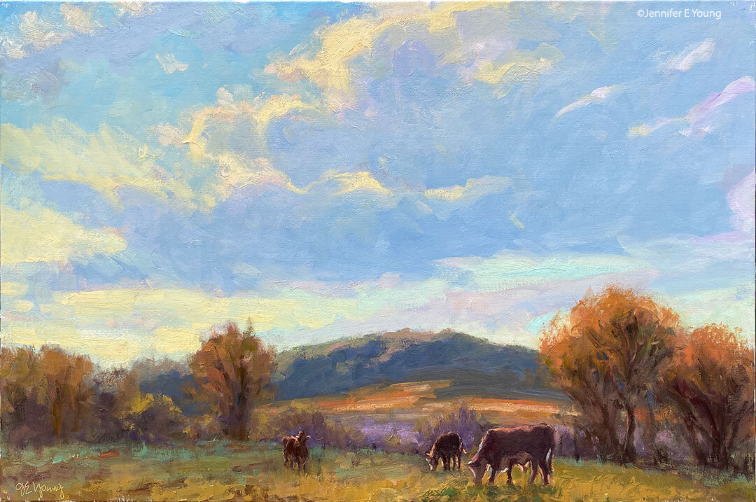
Here are a couple of smaller paintings I did recently to include in my upcoming show. They are each 12x12" gallery wrapped:

"Early Lavender"

"Golden Valley"

Often times when collectors are interested in my smaller works, they are looking for pairs or multiples to use in a grouping. So I do try to keep that in mind when I am creating the smaller ones-- especially my minis. I don't go about creating "matching sets", but as I am working I think about compliments.

Because there are so many ways to hang art, I created a little sampling of ideas on my website that addresses some of the possibilities. It can really be a fun endeavor in itself, and an expression of one's own personal style and creativity as a collector. Some people like a very formal, symmetrical presentation, while others like to mix it up. Some people prefer that all frames match, but I'm one of those who enjoys an eclectic presentation and think that variety of frame styles presented together can look pretty neat, so long as they compliment each other (and of course the room's decor.) I've even seen both framed and unframed work hanging together to great effect.

While sometimes there is a perfect small spot to display a single painting, these smaller paintings can be shown in so many other ways. They can be stacked one over another on a narrow wall, or presented in groupings over a larger piece of furniture like a sofa or console. They can be used instead of sconces to flank a nice mirror over a buffet or hutch (I've done this in my dining room before). They can even be displayed more informally, and sit atop a mantle or book shelf.

Here are a couple of snapshots from my last open studio that shows how I displayed smaller works as part of a larger grouping:


Jennifer Young; Vibrant Landscapes www.jenniferyoung.com ContactÂ