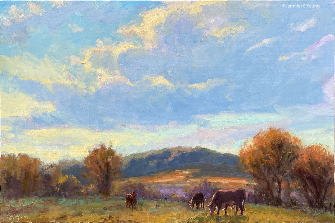
Landscape Values

My mom was here visiting with me recently and I asked her about a watercolor class she had signed up for not long ago. "It wasn't so hot," she said. "We didn't learn much of anything. The teacher just kept saying 'remember your values'. We didn't know what we were doing, and we didn't know what 'values' she was talking about!"  

I had to laugh. Family values? Stock values maybe? I guess it's understandable that someone who has been involved in art and painting for a while would assume that everyone knows what "values" are in painting. But not everyone has that clear understanding, so I thought I'd write some of what I know about values here and in a subsequent post or two. (Mom, if you're reading, take notes. Pop quiz later!)

Values in painting are essentially the range of lights and darks in a composition. Seeing values in black and white is somewhat easier than seeing values in color, so a lot of times it is beneficial to create a value sketch of your subject first if you are having trouble discerning how light or dark something should be.

The trouble with values in color is that you now have color temperature thrown into the mix and judging values can be somewhat more confusing, especially when painting en plein air.  What's lighter, the sky or the ground? The rooftops or the side of that bright yellow building?  Understanding a little bit about how the light plays across a landscape can help to create a more convincing scene. 

That is why creating value studies before you jump into painting can be very helpful. Here is a very quick value study I did of a Lake Como scene I am getting ready to paint. I don't always do this, but for more complicated scenes it can be helpful:

This little study will help me to internalize my lights and darks so that I can "remember my values" when I start my work with color.

Tags: art painting landscape painting artist plein air Italy travel

Beach Sunrise

Today I finished a painting of a sunrise scene from last summer when I stayed at the beach in Nags Head North Carolina. For some reason I was intent on seeing the sunrise while we were there. We saw a number of gorgeous sunsets in the evenings but the sun sets over the sound and the sun rises over the ocean. So I nagged my husband to get up with me one morning and catch the sunrise over the ocean. Why I couldn't go alone is beyond me now; but for some reason, he HAD to come. Unfortunately in my exuberance we were about an hour early, so my romantic vision of togetherness under the morning sun soon turned to sitting on the beach in the dark and listening to Dave grumble and shuffle around, trying to find a spot to lie down and finish his night's sleep. Eventually, however, we were rewarded with a beautiful soft misty sunrise over the clouds. Here is the painting inspired by that morning:

sunrise beach painting by Jennifer Young

sold

I painted this scene with a limited palette (alizarin crimson, cadmium yellow pale, ultramarine blue, and pthalo green, plus white.) This is a scene that called for using a lot of "colored grays". Colors that may even read as "mud" in other paintings, created the soft, barely there light that I was going for. At first I thought I'd have to dip into my arsenal of more vivid colors (like permanent rose and cadmium orange) to get the sunrise effect, but because so much of the painting is muted and soft, my crimson and yellow mixtures really popped. My favorite part of this scene is the way the light skips across the water.

I painted this little study en plein air, and since that time I have been wanting to create something similar, but larger and more dynamic.

sold

I used a very limited palette on this one too, mainly because I was under such limited time constraints and didn't have time to squeeze out a bunch of tube colors. One thing I learned from this little painting is that when painting sun/sky paintings on location you really need to keep your brushes and turpentine clean. You also need to paint extremely fast. Screaming at the changing light doesn't really help, but it may possibly make you feel better.

Red Canvases

Since I put my first painting demonstration up on my website a couple of years ago, I have had a number of people ask me about the red toned canvas I used. That demo is a couple of years old. I should probably update that section of my site and add some newer demonstrations, but I just haven't had the time. I used to underpaint many of my landscapes with red (not architectural scenes, however). I rarely do this any more, except when I do my little minis. I used to feel some comfort in having something down on canvas besides the blank whiteness, and the red underpainting was kind of fun. But after a while I found it took too much time to apply the undercoat and I spent a lot of time trying to cover it up in the passages where I wanted it to be cool (such as in areas of far distance.) I think that the reason it still works on the little paintings is that the red undertone does make the colors pop, but with such a small surface I do not need to labor on covering it up for my cool distances.

I will still often tone my canvases with a rather opaque, neutral gray or a warm beige (a tone of raw sienna thinned and scrubbed in a translucent manner over the white of the canvas) when I paint out of doors. The neutral tone of the canvas reduces the bright glare. In the photo below you can see one of my gray-toned panels underneath the plain white ones.

Ideally your palette color should match the color of your canvas for accurate color mixing. In the studio I have a white palette and paint on white canvases. But outdoors my palette is either wood color or a neutral grey. It is not a "must" to match canvas and palette, but it does help to predict what the mixed color will look like when it's laid down on the canvas.

Tags: art painting landscape painting artist plein air

Painting in the mountains- continued

On that same mountain excursion I went back again to the beautiful orchard I had attempted capturing on that first afternoon. This time I selected a different view for my 9x12" canvas, using a great red barn as a focal point. I'm very happy with the way this one developed:

sold

If I make any adjustments, they will be very little. I love this scene so much I decided to do a larger version in the studio. Here it is, still in the "blocking in" stage, using my little plein air as a reference:

painting landscape painting artist plein air

Painting in the mountains- day two

The following morning is bright and beautiful. I decided to start out after breakfast by painting a little vignette right on the grounds where I was staying. I noticed a little whitewashed garden shed, (which I am told used to be a chicken coop) because it had some nice light and cast shadows from a neighboring tree. The light is soft and dewy and so this is the feeling I'd be going for. One thing I've learned from trial and error is to try and think in big shapes first. It is a good idea to lay in your darkest darks and lightest lights first, to help key the rest of the painting. With this subject and the small size of my canvas, that is a relatively easy task. Here is my little canvas, measuring 10"x8".

*Tip: I pretty much never use white paint directly out of the tube. It is too stark and too cool, even if the local color actually is white. The temperature of the light and the reflected light from other elements in the picture will effect the local color. Here I mix a tiny, tiny dab of cad. yellow and cad. red in with the white ( a little goes a long way) to warm it up a bit. 

*Tip: There were other buildings behind this little "chicken coop" that I could see in the background, but the only thing that really interested me was the clothesline, so that's all I included. I don't put in everything I see, just because it's there! My highest priority is to make an interesting painting, and the other buildings in the distance on such a small canvas would have just distracted from my center of interest.

Tags: art painting landscape painting artist plein air