The making of a commission
It's hard to believe summer is almost over. The move of my home and business, along with family matters, tended to completely monopolize my spring and summer, and yet there is still so much to do. While we are slowly settling into the house, it will be some time before I have a studio. So I have "made do" with either painting outside in the blazing summer heat, or setting up a temporary studio with drop cloths in my poorly lit living room. For those reasons, my painting production has been down and it's been driving me a little crazy. Nevertheless, opportunity waits for no one, and commissions are a special kind of opportunity. Time to pull out the drop cloths and shop lights again! :-) I have been painting for 20 years, and in that time, I've had a variety of commissions. Some are more "challenging", and some are pure delight. Of course, the latter are more pleasurable, but all commissions have been, to me, opportunities for growth as an artist.
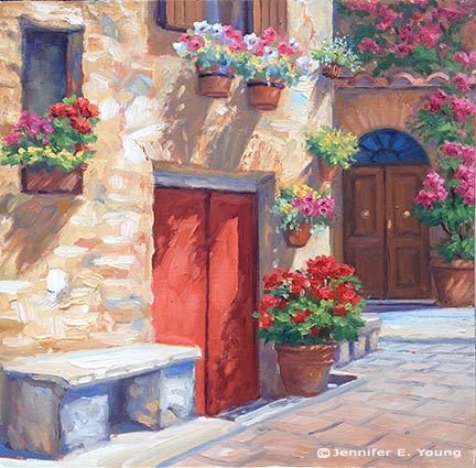
My latest commission, in spite of my less than ideal work environment, fell distinctly in the realm of the delightful. I met the client during a painting demonstration at the Little Gallery where my work was being featured in June. He happened to love one of my paintings in that show, called "The Potted Garden, Pienza":
The only issue was that the format (square) wasn't quite right. He was looking for a slightly larger, more vertical painting, and a companion piece of the same size to complement it in an adjacent spot.
I loved this little scene and I was happy to explore it again with a different format. So my first task was to convert my square composition to a vertical piece. Luckily, the architectural subject matter leant itself to the task naturally, and I was able to use Photoshop to render a "sketch" for a proposal in much faster time than I would have been able to do free-hand:

As you can see, I didn't labor over rendering the upper portion. The purpose was just to continue it upward to demonstrate how it would look. (Photoshop is a very expensive program, but nothing beats it for working out compositional options for paintings!)
In all honesty, because the location of the focal point was in the right position for both the original 12x12" and the commissioned 16x12" format, I didn't have to do much to the composition of the original painting beyond extending it. That's not always the case, believe me, but this time things worked out really well. But because I was losing a window on the upper left, I did suggest that I replace the two flower pots under the window for a larger, single hanging basket, as this would give this area more unity.
Once I received the client's approval for my proposal of the first painting, I set to work finding a second composition that I would create as a companion piece. I'll cover that in the next installment. Stay tuned!
